A model that predicts well is useful. A model you can also explain is trustworthy. As predictive models have grown more accurate, they have often grown more opaque: a gradient boosting ensemble (Chapter 11) or a deep network (Chapter 15) can involve thousands of parameters interacting in ways no person can trace by hand. This chapter is about closing that gap. It introduces the tools that let us look inside a fitted model and answer questions like “which features matter?”, “how does this feature change the prediction?”, and “why did the model decide this for this particular case?”.
The motivation is practical, not philosophical. A bank that denies a loan must, by law in many jurisdictions, give a reason. A doctor will not act on a risk score without understanding what drives it. A data scientist debugging a model needs to know whether it learned something real or just memorized an artifact of the training data.1 In all of these settings, the prediction alone is not enough. We need an account of how the model got there.
Key idea
Interpretability is not a single technique but a goal, and there are two broad routes to it. We can use models that are transparent by construction (linear regression, a short decision tree (Chapter 8), a generalized additive model (Chapter 6)), or we can fit a flexible black-box model and then apply post-hoc explanation methods on top of it. This chapter focuses on the second route, because that is where the interesting tooling lives, but the first route is always worth considering first.
It helps to separate two words that are often used interchangeably. Interpretability usually refers to models that are understandable in themselves: you can read the coefficients or trace the tree. Explainability usually refers to producing human-readable accounts of an otherwise opaque model after the fact.2 A second useful split is global versus local explanations. A global explanation describes the model’s behavior across the whole data distribution (“income is the most important feature overall”). A local explanation describes a single prediction (“for this applicant, the low credit score pushed the decision toward denial”). Most methods in this chapter come in both flavors, and we will be explicit about which is which.
By the end of the chapter you will be able to rank features by importance, visualize the shape of a feature’s effect with partial dependence and individual conditional expectation plots, explain individual predictions with LIME and Shapley values (SHAP), and reason about which method to reach for in a given situation. The canonical free reference for this material is Molnar’s Interpretable Machine Learning (2022), available at https://christophm.github.io/interpretable-ml-book/; the broader research area is surveyed under the heading of explainable AI at https://en.wikipedia.org/wiki/Explainable_artificial_intelligence and in Barredo Arrieta et al. (2020). A gentle hands-on course is Kaggle’s machine learning explainability track at https://www.kaggle.com/learn/machine-learning-explainability.
We will work throughout with one running example so that the methods are directly comparable.
When to use this
Reach for post-hoc interpretation whenever you have a model that is too complex to read directly but whose behavior you still need to justify, audit, or debug. If a simple transparent model fits about as well, prefer it and skip most of this chapter.
35.1 A running example
We will predict house sale prices from the Ames housing data (De Cock, 2011), a modern replacement for the venerable Boston housing set. It is large enough to be interesting and clean enough to keep the focus on interpretation rather than data wrangling. We fit a random forest (Chapter 13), which is accurate and nonlinear but completely opaque on its own, and then spend the rest of the chapter explaining it.
Show code
library(AmesHousing)library(randomForest)library(ggplot2)set.seed(1)ames<-as.data.frame(make_ordinal_ames())# Keep a compact set of intuitive predictors so the explanations stay readable.keep<-c("Sale_Price", "Gr_Liv_Area", "Overall_Qual", "Year_Built","Total_Bsmt_SF", "Garage_Cars", "Full_Bath","Lot_Area", "Fireplaces", "TotRms_AbvGrd")ames<-ames[, keep]# Ordinal factors come through as ordered factors; random forest is happiest# with plain numerics for the quality scale, so convert it.ames$Overall_Qual<-as.integer(ames$Overall_Qual)# A train / test split.n<-nrow(ames)train_id<-sample(seq_len(n), size =floor(0.7*n))train<-ames[train_id, ]test<-ames[-train_id, ]rf<-randomForest(Sale_Price~., data =train, ntree =300, importance =TRUE)rf#> #> Call:#> randomForest(formula = Sale_Price ~ ., data = train, ntree = 300, importance = TRUE) #> Type of random forest: regression#> Number of trees: 300#> No. of variables tried at each split: 3#> #> Mean of squared residuals: 787987041#> % Var explained: 87.73
The printout reports the model’s out-of-bag error, but it tells us nothing about why the forest predicts what it predicts. That is the gap the rest of the chapter fills. To have a transparent point of comparison, we also fit an ordinary linear model on the same data; its coefficients are an interpretation we can check the fancier methods against.
The linear model is its own explanation: each coefficient says “holding everything else fixed, one more unit of this feature changes the predicted price by this many dollars.” Every method below is, in one way or another, an attempt to recover that kind of plain-language statement from a model that does not hand it to us for free.
35.2 Feature importance
The first question anyone asks of a model is which inputs matter. Feature importance assigns each feature a number summarizing how much the model relies on it, producing a ranked list. This is a global explanation: it describes the model as a whole, not any single prediction.
There are two common ways to measure it, and they answer slightly different questions. The first is impurity-based importance, which is specific to tree ensembles. Each time a tree splits on a feature, the split reduces the impurity (for regression, the variance) of the target within the resulting groups. Summing those reductions across every split on a feature, and across every tree, gives a measure of how useful that feature was for building the forest. It is free to compute because the forest already did the work while training, but it has a known bias: it tends to inflate the importance of high-cardinality features (those with many possible split points) regardless of whether they are truly predictive.3
The second method, permutation importance, is model-agnostic and more trustworthy. The idea is disarmingly simple. Measure the model’s error on held-out data. Then take one feature, shuffle its values across the rows (which destroys any relationship between that feature and the target while keeping its marginal distribution intact), and measure the error again. If the error jumps, the model was relying on that feature; if it barely moves, the feature was not doing much. The increase in error is the feature’s importance.
Intuition
Permutation importance asks, “if I scramble this column, how much worse does the model get?” A feature the model truly depends on, when scrambled, wrecks the predictions. An irrelevant feature can be scrambled with no effect.
35.2.0.1 Formal definitions
Fix a fitted prediction function \(\hat f : \mathcal{X} \to \mathbb{R}\) with feature vector \(X = (X_1, \dots, X_p)\) and target \(Y\), and let \(L(y, \hat y)\) be a loss (for regression, squared error). Write \(X_{-j}\) for all features except the \(j\)th. The generalization error is \(e = \mathbb{E}\,[L(Y, \hat f(X))]\).
Permutation importance replaces \(X_j\) with an independent copy \(\tilde X_j\) drawn from its own marginal \(P_{X_j}\), independently of \((X_{-j}, Y)\). The permuted error and the importance are
The expectation over \(\tilde X_j\) marginalizes the \(j\)th feature out of \(\hat f\) while keeping its marginal intact, which is exactly what shuffling a column estimates. With a held-out sample \(\{(x^{(i)}, y^{(i)})\}_{i=1}^{n}\) and a permutation \(\pi\) of \(\{1, \dots, n\}\), the Monte Carlo estimator is
where \(x^{(i)}_{j \leftarrow v}\) denotes \(x^{(i)}\) with its \(j\)th coordinate overwritten by \(v\). Averaging Equation 35.2 over nsim independent permutations reduces the variance of the estimate, which is why a single shuffle is too noisy to trust.
For squared-error loss there is a clean identity that explains what permutation importance measures. Suppose \(\hat f\) is fixed and write \(g(X) = \hat f(X)\). Adding and subtracting, \(e_j^{\text{perm}} - e\) decomposes the change in expected loss purely in terms of how much \(\hat f\) moves when \(X_j\) is randomized. In the special case where \(\hat f\) is the true regression function and the loss is squared error, one can show
because the cross term \(\mathbb{E}[(Y - \hat f(X))(\hat f(X) - \hat f(\tilde X_j, X_{-j}))]\) vanishes when the residual \(Y - \hat f(X)\) is mean-zero and independent of the perturbation. Thus permutation importance is non-negative for a well-fit model and equals the mean squared sensitivity of the prediction to feature \(j\). When features are correlated this identity is only approximate, because \((\tilde X_j, X_{-j})\) then lands off the data manifold and the cross term no longer cancels, which is the formal source of the extrapolation bias warned about below.
Warning
When \(X_j\) is correlated with \(X_{-j}\), the independent draw \(\tilde X_j\) creates feature combinations that never occur in the data, so Equation 35.1 evaluates \(\hat f\) in regions where it was never trained. Importance can then be split arbitrarily between correlated features or even inflated. A conditional variant draws \(\tilde X_j \sim P_{X_j \mid X_{-j}}\) instead of the marginal, which stays on-manifold but estimates a different quantity (the importance of \(X_j\) given the others). Grouped permutation, where correlated features are shuffled together, is a practical compromise.
For completeness, the impurity (mean decrease in impurity, MDI) importance has its own formula. For a single tree \(T\), let the nodes that split on feature \(j\) be \(\{t : v(t) = j\}\), where \(v(t)\) is the splitting variable at node \(t\). Let \(p(t) = n_t / n\) be the fraction of samples reaching node \(t\) and \(\Delta i(t)\) the decrease in node impurity achieved by the split (for regression, the weighted variance reduction). The MDI of feature \(j\) in a forest of \(M\) trees is
A theoretical result of Louppe and colleagues (2013) shows that in the population limit, for a fully developed totally randomized tree, \(\mathrm{MDI}_j\) equals a sum of mutual information terms \(I(X_j; Y \mid \text{conditioning sets})\), so MDI is a genuine information-theoretic measure of relevance. The high-cardinality bias arises in the finite-sample, greedy (non-randomized) case: a feature with many candidate split points has more chances to produce a spuriously large in-sample \(\Delta i(t)\), inflating Equation 35.4 even when the feature is noise. Permutation importance, evaluated on held-out data, does not share this defect.
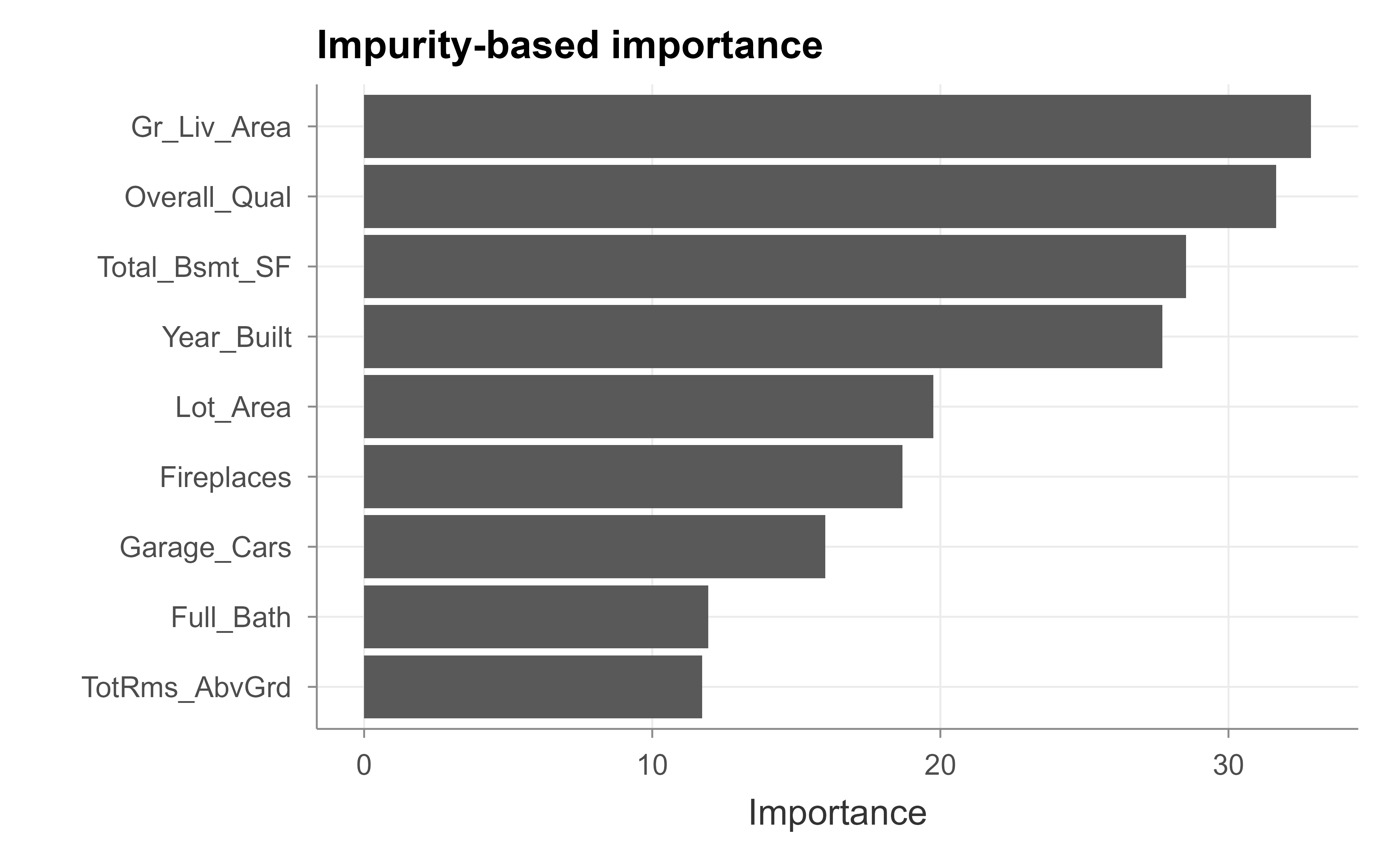
The vip package computes both kinds (Greenwell and Boehmke, 2020). We start with the impurity-based version, which random forest already stored for us; Figure 35.1 shows the result.
Figure 35.1: Impurity-based feature importance from the random forest.
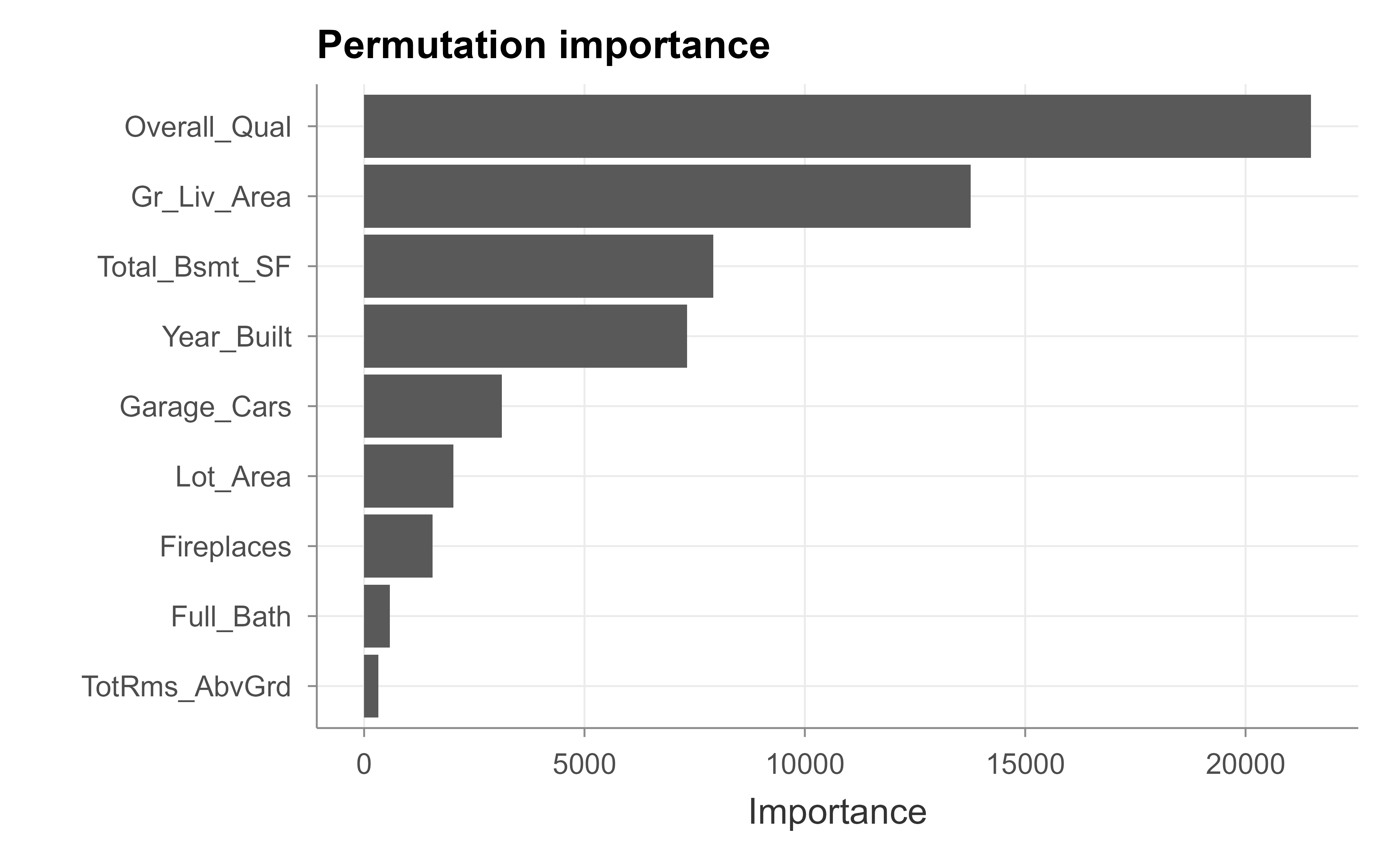
Now the model-agnostic permutation version, which we compute on the test set so that it reflects generalization rather than fit; Figure 35.2 shows the result.
Figure 35.2: Permutation-based feature importance on held-out data.
Read these plots (Figure 35.1 and Figure 35.2) from the top down: the longest bars are the features the model leans on most. For Ames, overall quality and above-ground living area dominate in both methods, which matches intuition about what drives house prices and matches the large coefficients in our linear model. When the two importance methods agree, you can be fairly confident in the ranking. When they disagree, the disagreement is itself informative, often pointing to the cardinality bias of the impurity measure.
Warning
Importance tells you how much a feature matters, not which direction it pushes predictions or what shape its effect has. A feature can be highly important and have a U-shaped effect that a single number cannot convey. For direction and shape, we need the effect plots in the next section.
Tip
Permutation importance is computed many times with different random shuffles (nsim above) because a single shuffle is noisy. Report the average, and if decisions ride on the ranking, look at the variability across shuffles too.
35.3 Effect plots: partial dependence and ICE
Importance ranks features; effect plots show the relationship between a feature and the prediction. The workhorse is the partial dependence plot (PDP), introduced by Friedman (2001). It answers a clean question: as one feature varies over its range, what happens to the average prediction, with all other features left as they are in the data?
Mechanically, to draw the partial dependence of price on living area, we do the following. Pick a grid of living-area values. For each grid value, overwrite the living-area column of every row in the data with that one value, leaving all other columns untouched, and ask the model to predict. Average those predictions. That average is the partial dependence at that grid point. Plotting the averages across the grid traces out the marginal effect of living area on the model’s output.
Key idea
A PDP marginalizes over the other features by brute force. It literally asks the model, “if this one feature were x, what would you predict on average across the population?” The result isolates the feature’s effect from the others, as long as the features are not strongly correlated.
35.3.0.1 Formulation and the marginal-versus-conditional distinction
Partition the features as \(X = (X_S, X_C)\), where \(S\) is the subset of interest (usually one feature) and \(C\) its complement. Friedman’s partial dependence function is the expectation of \(\hat f\) over the marginal distribution of \(X_C\):
This is exactly the “overwrite the column, predict, average” recipe. It is crucial that Equation 35.5 integrates against the marginal\(P_{X_C}\), not the conditional\(P_{X_C \mid X_S}\). The marginal choice is what makes the PDP a clean causal-style “all else equal” sweep, but it is also why correlated features create off-manifold inputs: pairing every observed \(x_C^{(i)}\) with an arbitrary \(x_S\) generates combinations \((x_S, x_C^{(i)})\) that may have probability near zero. The conditional alternative \(\mathbb{E}[\hat f(X_S, X_C) \mid X_S = x_S]\) stays on-manifold but confounds the effect of \(X_S\) with the effects of the features correlated with it, so it no longer isolates \(X_S\). This tension is unavoidable, and it is precisely the gap that accumulated local effects (ALE) close.
35.3.0.2 Additive recovery
If the model happens to be additive, \(\hat f(x) = \sum_{j} h_j(x_j)\), then for \(S = \{j\}\),
so the PDP recovers each component \(h_j\) up to a vertical shift. This is why a PDP of a generalized additive model reproduces its smooth terms exactly, and why a PDP of a linear model is a straight line with the model’s slope. The result also tells us what a PDP cannot show: any part of \(\hat f\) that lives in interaction terms is averaged away, which is the formal reason ICE plots are needed to detect interactions.
35.3.0.3 ALE in one line
ALE replaces the level of the prediction by its local derivative, integrated over the conditional distribution. For a single feature \(j\),
estimated by binning \(X_j\), taking the average prediction difference across each bin’s edges using only points that fall in the bin, and accumulating. Because it conditions on \(X_j\) being in a small window and differences out the rest, ALE never evaluates \(\hat f\) on combinations absent from the data, which is what makes it robust under correlation.
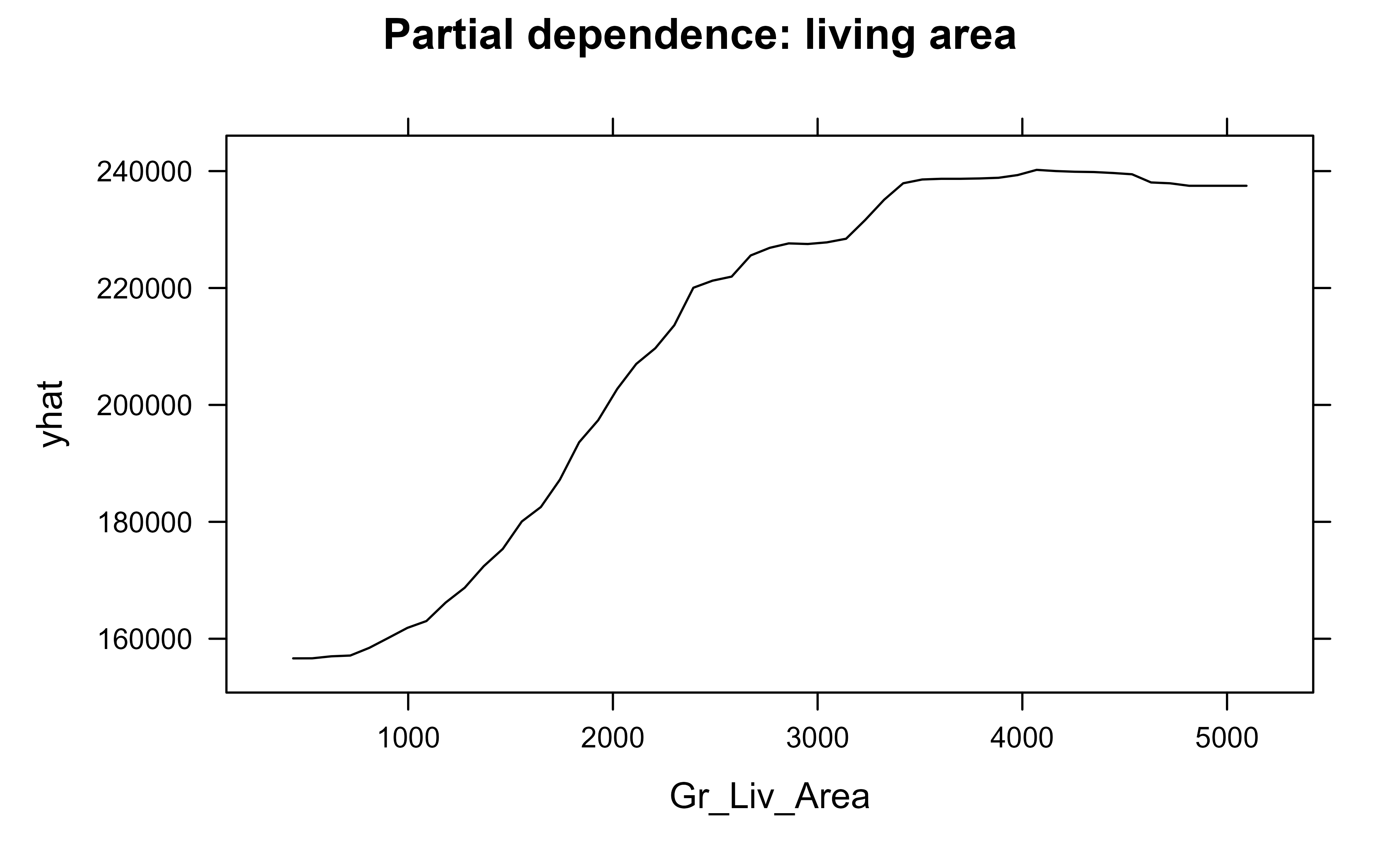
The pdp package implements this directly (Greenwell, 2017), and Figure 35.3 shows the partial dependence of price on living area.
Show code
library(pdp)pd_area<-partial(rf, pred.var ="Gr_Liv_Area", train =train)plotPartial(pd_area, main ="Partial dependence: living area")
Figure 35.3: Partial dependence of predicted sale price on above-ground living area.
The curve rises from left to right: bigger houses cost more, as expected, and the slope flattens at the high end, suggesting diminishing returns to sheer size. A linear model could never have shown that bend; the PDP read it straight out of the forest.
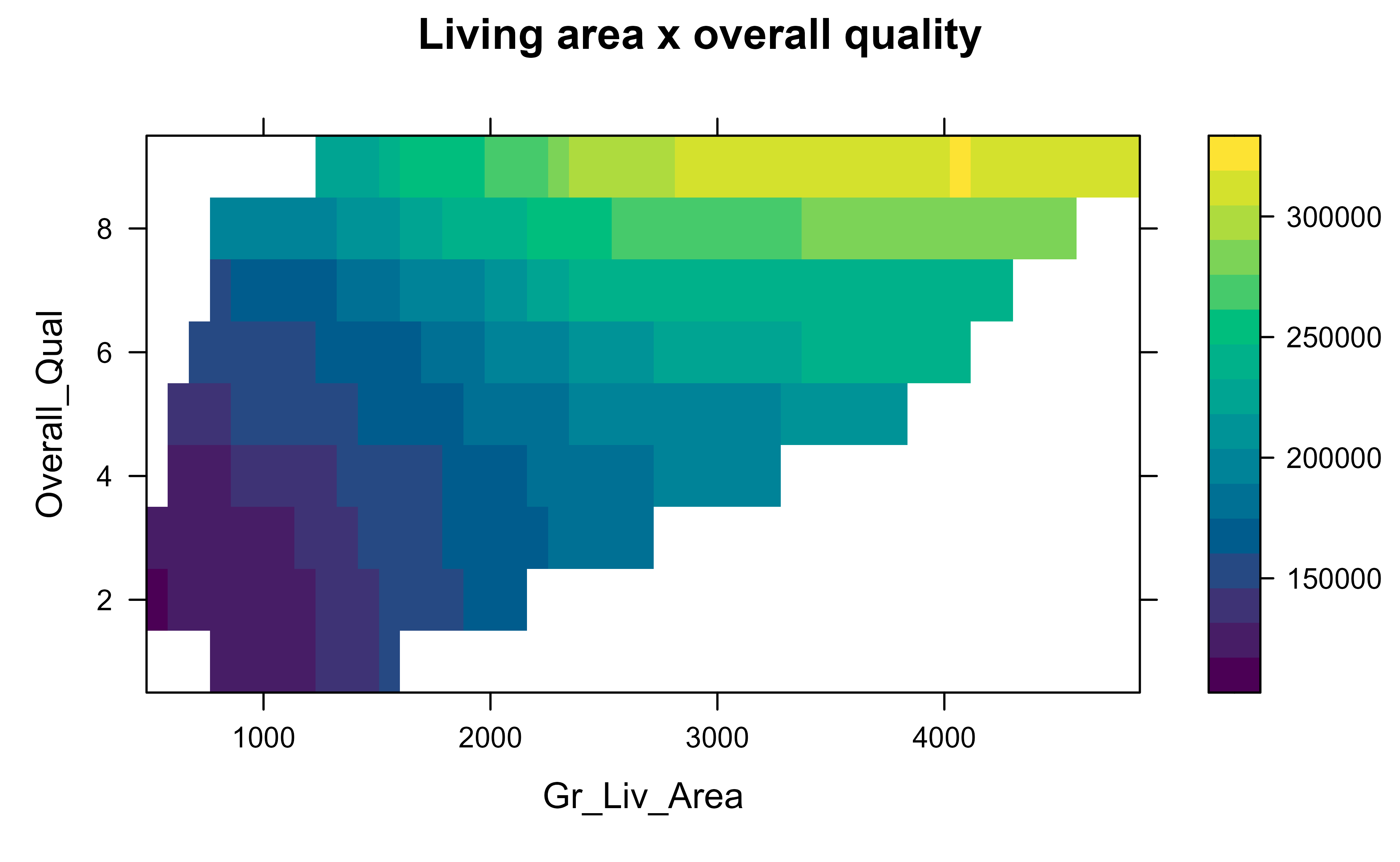
Partial dependence can also show how two features interact, by varying them jointly on a grid and drawing the result as a surface or heatmap. Figure 35.4 looks at price as a function of living area and overall quality together.
Show code
pd_two<-partial(rf, pred.var =c("Gr_Liv_Area", "Overall_Qual"), train =train, chull =TRUE)plotPartial(pd_two, main ="Living area x overall quality")
Figure 35.4: Two-way partial dependence on living area and overall quality.
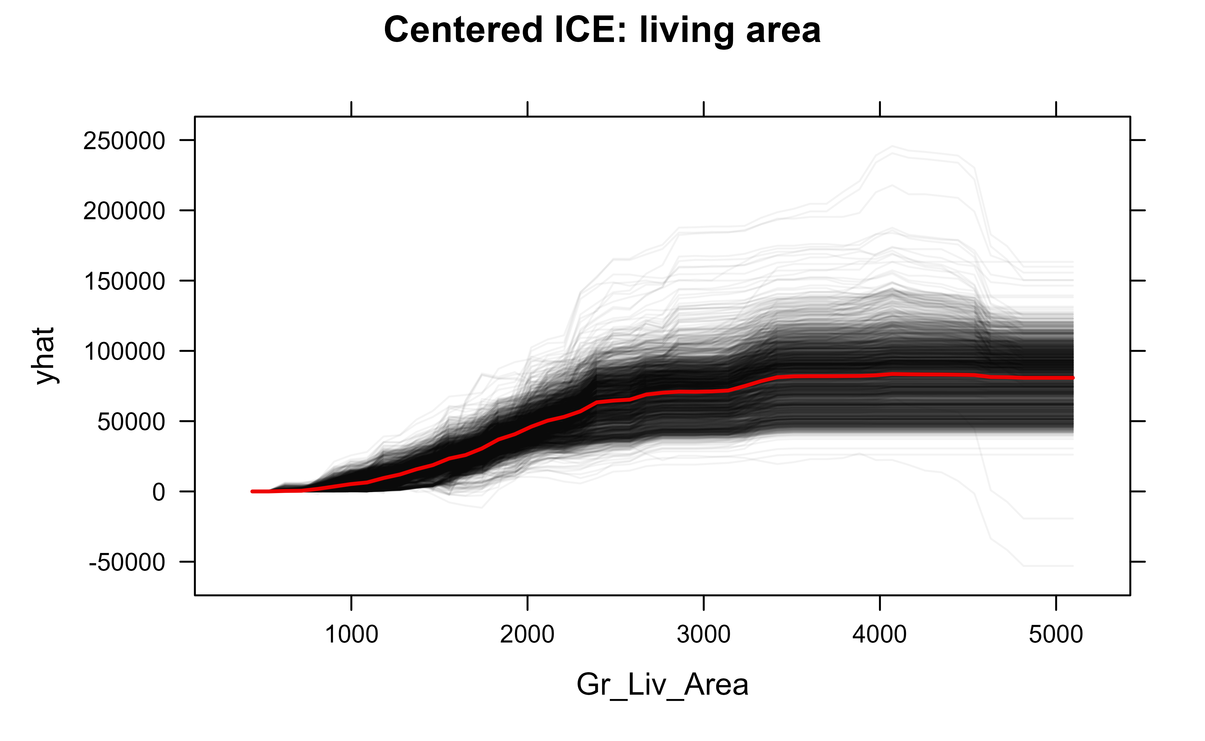
The PDP has one important blind spot. Because it averages over the population, it can hide the fact that the feature behaves differently for different subgroups. If living area pushes prices up for large lots but is flat for tiny lots, the average can look like a mild slope and you would never know the two stories existed. The individual conditional expectation (ICE) plot fixes this (Goldstein et al., 2015). Instead of averaging, it draws one line per observation: each line shows how that single house’s prediction would change as we sweep its living area across the grid. The PDP is simply the average of all the ICE lines.
Intuition
A PDP is the chorus; ICE plots are the individual voices. If every voice sings the same melody, the chorus represents them faithfully. If the voices split into groups singing different tunes, the average is misleading and the ICE plot reveals it.
Figure 35.5 draws the centered ICE curves for living area together with their average.
Show code
ice_area<-partial(rf, pred.var ="Gr_Liv_Area", train =train, ice =TRUE, center =TRUE)plotPartial(ice_area, alpha =0.05, plot.pdp =TRUE, main ="Centered ICE: living area")
Figure 35.5: Centered ICE plot for living area; the thick line is the partial dependence (average).
Formally, the ICE curve for observation \(i\) fixes that row’s complement features at their observed values \(x_C^{(i)}\) and sweeps \(x_S\):
so the PDP Equation 35.6 is literally the pointwise average of the ICE curves Equation 35.8. The centered (c-ICE) version anchors each curve at a reference point \(x_S^{\star}\) (typically the minimum of the grid):
We centered the curves so they all start at zero on the left, which makes their shapes comparable regardless of each house’s baseline price. Reading the plot: if the thin lines fan out and cross, different houses respond differently to size, an interaction the PDP alone would have hidden. If they move in near-parallel, the average curve tells the whole story.
Warning
Both PDP and ICE rely on overwriting one feature while holding the others fixed, which can create impossible combinations: a 4000-square-foot house on a 1000-square-foot lot, for instance. When features are strongly correlated, the model is asked to predict on inputs it never saw in training, and the plots can mislead. Accumulated local effects (ALE) plots are a more robust alternative in that case; see Molnar (2022).
To summarize the global picture so far: importance tells you which features matter, PDPs tell you the average shape of each feature’s effect, and ICE plots warn you when that average hides subgroup differences. Together they give a reasonably complete description of the model’s global behavior. We turn next to explaining single predictions.
35.4 Local explanations
Global summaries are the right tool for understanding a model overall, but they cannot answer the question a loan applicant or a clinician actually asks: “why this prediction, for me?” Local explanation methods answer exactly that, one observation at a time. We cover the two dominant approaches, LIME and Shapley values.
35.4.1 LIME
LIME stands for local interpretable model-agnostic explanations(Ribeiro, Singh, and Guestrin 2016). Its premise is that even a wildly nonlinear model looks approximately linear if you zoom in close enough to a single point, the same way the curved surface of the Earth looks flat in your backyard. So to explain one prediction, LIME builds a simple, interpretable model (typically a sparse linear model) that mimics the black box in the neighborhood of that one point, and reads off the simple model’s coefficients as the explanation.
The recipe is:
Take the instance you want to explain.
Generate many perturbed versions of it by randomly tweaking its feature values.
Get the black-box model’s prediction for each perturbed point.
Weight the perturbed points by how close they are to the original instance, so nearby points count more.
Fit a simple, interpretable model (a weighted sparse linear regression) to those weighted predictions.
Report that simple model’s coefficients as the local explanation.
Intuition
LIME does not try to understand the whole model. It only builds a tiny, faithful caricature that is accurate right around the one prediction you care about, and trusts that caricature exactly that far and no further.
35.4.1.1 The LIME objective
LIME makes the recipe precise as a weighted, regularized local regression. Let \(x\) be the instance to explain and \(\hat f\) the black box. Explanations live in an interpretable representation \(z' \in \{0,1\}^{d}\) (for tabular data, binned or standardized features); a map \(h_x(z')\) sends an interpretable vector back to the original input space. Let \(G\) be a class of interpretable models (sparse linear models), \(\pi_x(z)\) a proximity kernel that weights a perturbed point \(z\) by closeness to \(x\), and \(\Omega(g)\) a complexity penalty. LIME solves
The standard choices are an exponential kernel \(\pi_x(z) = \exp(-D(x,z)^2 / \sigma^2)\) for distance \(D\) and kernel width \(\sigma\), a linear surrogate \(g(z') = w_g^\top z'\), and \(\Omega(g) = \infty \cdot \mathbb{1}[\|w_g\|_0 > K]\) enforcing at most \(K\) nonzero coefficients (the n_features argument), realized in practice by LASSO or forward selection. The fitted weights \(w_g\) are the reported explanation. Equation Equation 35.10 makes explicit why LIME is unstable: the solution depends on the kernel width \(\sigma\), the perturbation distribution generating the \(z\), and \(K\). There is no canonical \(\sigma\), and the bias-variance tradeoff it controls is real: too small and the surrogate sees too few distinct points (high variance), too large and the local linearity assumption fails (high bias). This non-uniqueness is exactly the contrast with Shapley values, which are pinned down by axioms.
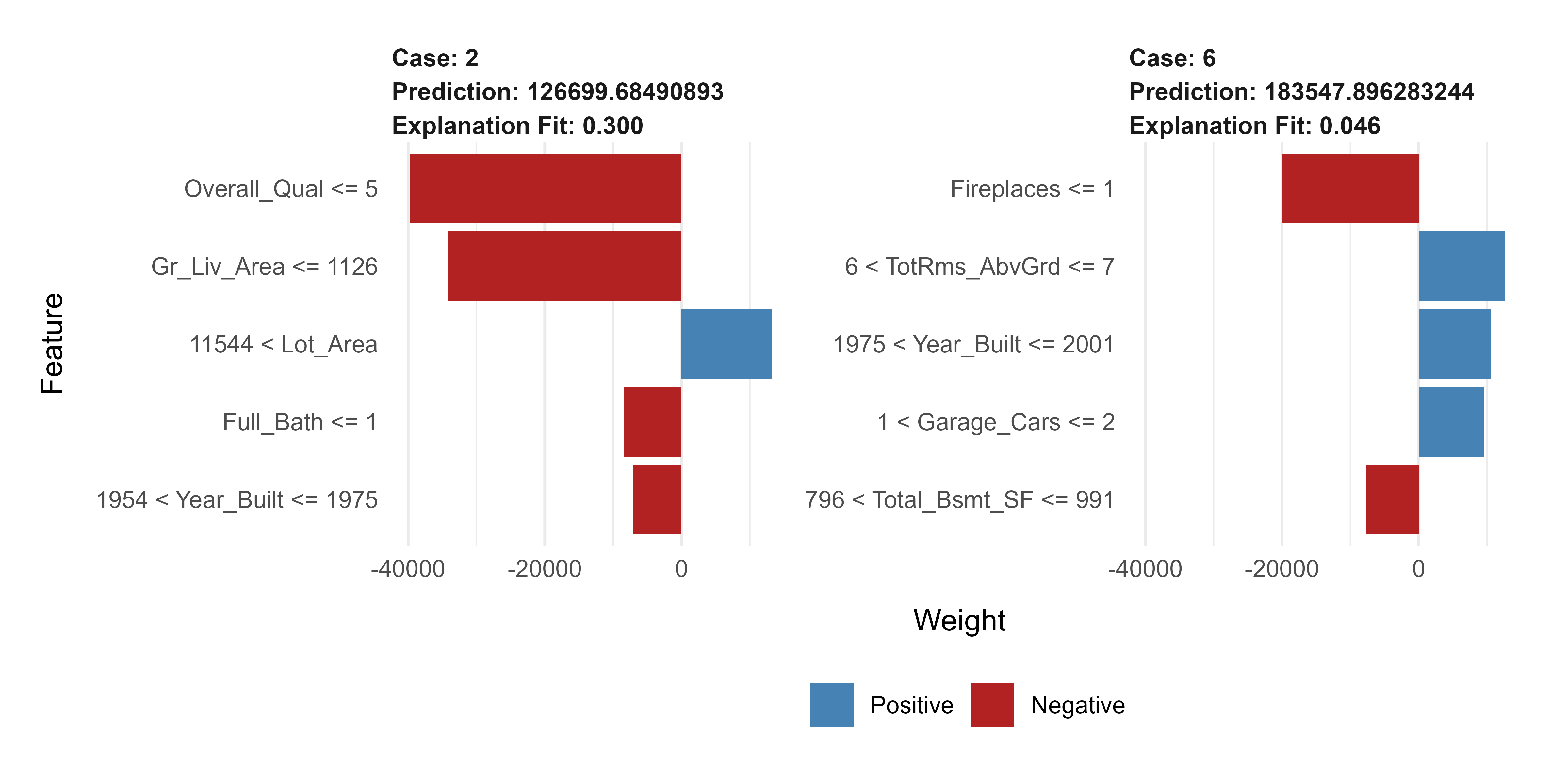
The lime package implements this for R (Pedersen and Benesty, 2021). We explain the model’s predictions for two specific houses from the test set, and Figure 35.6 shows the result.
Show code
library(lime)# lime does not ship support for randomForest regression out of the box,# so we register the two small methods it needs.model_type.randomForest<-function(x, ...)"regression"predict_model.randomForest<-function(x, newdata, ...){data.frame(Response =predict(x, newdata =newdata))}explainer<-lime(train[, setdiff(names(train), "Sale_Price")], model =rf)cases<-test[1:2, setdiff(names(test), "Sale_Price")]explanation<-explain(cases,explainer, n_features =5, n_permutations =500)plot_features(explanation)
Figure 35.6: LIME explanations for two individual house-price predictions.
Each panel explains one house. A bar to the right (supporting) means that feature, at its value for this house, pushed the prediction up; a bar to the left (contradicting) means it pushed the prediction down. The length is how strongly. So you can now make a per-house statement like “this prediction is high mainly because of high overall quality and large living area, partly offset by the small lot,” which is precisely the kind of account a global plot cannot give.
Warning
LIME’s explanations depend on choices that are easy to overlook: how perturbations are generated, the neighborhood width (the kernel), and how many features the simple model is allowed to keep. Change these and the explanation can change. Treat a single LIME output as a hypothesis about the prediction, not as ground truth, and check that it is stable before relying on it.
35.4.2 Shapley values and SHAP
LIME is fast and intuitive but, as just noted, somewhat ad hoc. Shapley values come at local explanation from a completely different and more principled direction: cooperative game theory (Shapley, 1953). Imagine the features are players cooperating to produce a prediction, and the “payout” to be divided among them is the difference between this prediction and the average prediction over the data. The Shapley value of a feature is its fair share of that payout, where “fair” is defined by a short list of axioms (every contribution is accounted for, features that never change the prediction get zero, and so on). Remarkably, exactly one allocation satisfies all the axioms, and that is the Shapley value.
Concretely, the Shapley value of a feature is its average marginal contribution across every possible ordering in which the features could be added to the model. To see what feature j contributes, you look at how much the prediction changes when j joins a coalition of features already present, and you average that change over all coalitions. Computing this exactly is exponential in the number of features, so in practice we approximate it by sampling coalitions.
Key idea
A Shapley explanation has a property the others lack: the feature contributions add up exactly to the gap between the prediction and the average prediction. Nothing is left unexplained and nothing is double-counted. This additivity is what makes Shapley values uniquely consistent.
35.4.2.1 The value function and the Shapley formula
Let \(N = \{1, \dots, p\}\) be the set of features and \(x\) the instance to explain. A coalition \(S \subseteq N\) is the set of features whose values are “known”; the rest are integrated out. Define the value function as the conditional expectation of the prediction given the known features:
The Shapley value of feature \(j\) is its average marginal contribution \(v(S \cup \{j\}) - v(S)\) over all coalitions \(S\) not containing \(j\), with the combinatorial weights that count orderings:
The weight \(\frac{|S|!\,(p-|S|-1)!}{p!}\) is the probability that, in a uniformly random ordering of the \(p\) features, exactly the members of \(S\) precede \(j\). Equivalently, averaging over all \(p!\) orderings \(\mathcal{O}\) and letting \(\mathrm{Pre}_j(\mathcal{O})\) be the features before \(j\),
Shapley’s theorem states that Equation 35.12 is the unique map from value functions to attributions \((\phi_1, \dots, \phi_p)\) satisfying:
Efficiency.\(\sum_{j=1}^{p} \phi_j = v(N) - v(\varnothing) = \hat f(x) - \mathbb{E}[\hat f(X)]\). This is the exact additivity referenced above.
Symmetry. If \(v(S \cup \{i\}) = v(S \cup \{j\})\) for every \(S\) not containing \(i\) or \(j\), then \(\phi_i = \phi_j\). Features that contribute identically get equal credit.
Dummy (null player). If \(v(S \cup \{j\}) = v(S)\) for every \(S\), then \(\phi_j = 0\). A feature that never changes the value gets zero.
Linearity. For two games \(v\) and \(w\), \(\phi_j(v + w) = \phi_j(v) + \phi_j(w)\). Attribution of an ensemble is the sum of attributions, which is what licenses TreeSHAP to sum over trees.
Efficiency is the additivity property; together with symmetry, dummy, and linearity it forces Equation 35.12, which is the precise sense in which the Shapley allocation is “the only fair one.”
35.4.2.3 Sketch of the efficiency proof
Efficiency follows directly from the ordering form Equation 35.13. Fix any single ordering \(\mathcal{O} = (\sigma_1, \dots, \sigma_p)\). The marginal contributions along that ordering telescope:
Every intermediate \(v(\cdot)\) cancels, leaving only the endpoints. Since this holds for each of the \(p!\) orderings, averaging preserves it, and exchanging the order of summation gives \(\sum_j \phi_j = v(N) - v(\varnothing)\). The dummy and symmetry axioms are immediate from Equation 35.12, and linearity holds because \(v \mapsto \phi_j(v)\) is a linear functional of \(v\).
35.4.2.4 KernelSHAP: estimating Equation 35.12 by weighted regression
The brute-force sum Equation 35.12 has \(2^{p}\) terms. SHAP (Lundberg and Lee (2017)) shows the Shapley values are the solution of a weighted linear regression, the additive feature attribution model \(g(z') = \phi_0 + \sum_{j} \phi_j z'_j\) on coalition indicators \(z' \in \{0,1\}^p\), fit to the value function \(v(\cdot)\) with the Shapley kernel
Minimizing \(\sum_{z'} \pi_{\text{SHAP}}(z')\,(v(z') - g(z'))^2\) recovers Equation 35.12 exactly in the limit of all coalitions, and approximately when coalitions are subsampled. This is the precise sense in which “SHAP unifies LIME and Shapley values”: KernelSHAP is LIME’s objective Equation 35.10 with the specific kernel Equation 35.14, no \(\ell_1\) penalty, and interpretable inputs equal to coalition membership, which is the unique configuration that makes LIME’s coefficients satisfy the Shapley axioms.
35.4.2.5 Marginal versus conditional value function
The value function Equation 35.11 uses the conditional expectation, which is correct but requires estimating \(P_{X_{\bar S} \mid X_S}\). Most implementations, including KernelSHAP’s default and fastshap, use the interventional (marginal) value function \(v(S) = \mathbb{E}_{X_{\bar S}}[\hat f(x_S, X_{\bar S})]\) that draws the unknown features from their marginal, independently of \(x_S\). The two agree under feature independence but differ under correlation, with the same on-manifold versus off-manifold tradeoff seen for PDP and permutation importance. The marginal version answers a purely functional “what does the model compute” question; the conditional version answers a data-aware “what do the features tell us” question.
35.4.2.6 TreeSHAP: exact and polynomial for trees
For a tree ensemble, the linearity axiom lets us compute Equation 35.12 per tree and sum. TreeSHAP (Lundberg, Erion, and Lee 2018) evaluates the conditional value function by pushing all coalitions through the tree simultaneously, tracking the proportion of each coalition that flows down each branch. This reduces the cost from \(O(2^p)\) to \(O(T L D^2)\) per explained instance, where \(T\) is the number of trees, \(L\) the number of leaves per tree, and \(D\) the maximum tree depth. The result is the exact Shapley value (no Monte Carlo error), which is why for tree models TreeSHAP is both the principled and the fastest choice.
We can compute Shapley-style explanations in R without leaving the pdp/vip ecosystem, using the fast Monte Carlo approximation in the fastshap package when it is available. The following chunk is guarded so the book still builds if that optional package is not installed; the code is the idiomatic way to do it.
Show code
library(fastshap)pred_wrapper<-function(object, newdata){as.numeric(predict(object, newdata =newdata))}x_explain<-test[1, setdiff(names(test), "Sale_Price")]shap_vals<-fastshap::explain(rf, X =train[, setdiff(names(train), "Sale_Price")], newdata =x_explain, pred_wrapper =pred_wrapper, nsim =50)shap_df<-data.frame( feature =names(shap_vals), contribution =as.numeric(shap_vals[1, ]))shap_df<-shap_df[order(abs(shap_df$contribution)), ]shap_df$feature<-factor(shap_df$feature, levels =shap_df$feature)ggplot(shap_df, aes(x =contribution, y =feature, fill =contribution>0))+geom_col()+scale_fill_manual(values =c("FALSE"="#c0392b", "TRUE"="#2980b9"), guide ="none")+labs(title ="SHAP contributions for one house", x ="Contribution to prediction (dollars)", y =NULL)
We can check the efficiency axiom Equation 35.12 directly: the SHAP contributions should sum to the gap between this house’s prediction and the average prediction over the background data. The following confirms the identity numerically (it runs only if fastshap is installed).
Show code
# Efficiency: sum of SHAP values ~= f(x) - E[f(X)] (the additivity axiom).baseline<-mean(predict(rf, newdata =train))prediction<-as.numeric(predict(rf, newdata =x_explain))shap_sum<-sum(as.numeric(shap_vals[1, ]))c(prediction_gap =prediction-baseline, shap_sum =shap_sum)
The two numbers match up to Monte Carlo error from the nsim sampled coalitions; with exact TreeSHAP they would agree to machine precision. Read the bars exactly as with LIME (right pushes the prediction up, left pushes it down), but with the guarantee that they sum to the difference between this house’s prediction and the average prediction. Averaging the absolute SHAP values of a feature over many observations also yields a global importance measure,
giving a single coherent framework that spans local and global explanation. That unification is the main reason SHAP became the de facto standard.
When to use this
Use LIME when you need a fast, intuitive local explanation and approximate fidelity is acceptable. Use SHAP when you need consistency and additivity, when explanations must withstand scrutiny (regulatory or scientific), or when you want local and global explanations from one coherent method. For tree ensembles specifically, TreeSHAP makes the principled choice also the practical one.
35.5 Other tools and the broader landscape
The methods above (importance, PDP/ICE, LIME, SHAP) cover the great majority of day-to-day interpretation work on tabular models. Several other tools extend the same ideas to richer settings and are worth knowing by name.
Once we move beyond tables to images and concepts, new methods are needed. Testing with concept activation vectors (TCAV) explains a neural network’s predictions in terms of human-friendly concepts (for example, how much the concept “stripes” influenced a “zebra” classification) rather than raw pixels (Kim et al., 2018). The reference code is at https://github.com/tensorflow/tcav, with the paper at http://proceedings.mlr.press/v80/kim18d.html and https://arxiv.org/abs/1711.11279.
Google’s PAIR (People + AI Research) group has built several interactive tools that make these ideas tangible without writing code, which are excellent for exploration and teaching:
Facets visualizes the distribution and quality of a dataset, which is the first step before trusting any explanation of a model fit to it: https://pair-code.github.io/facets/.
The Embedding Projector renders learned high-dimensional embeddings in two or three dimensions so you can see the structure a model discovered: https://projector.tensorflow.org/.
The image- and concept-level tools above (TCAV, the What-If Tool, the Embedding Projector) live in the Python and TensorFlow ecosystem and require a trained deep model and its backend, so we do not run them here. They are listed because the ideas (concept-based explanation, interactive what-if probing, embedding visualization) are part of every practitioner’s toolkit, even when the implementation lives outside R.
35.5.1 Two extended applications
The same interpretability mindset shows up in applied problems that may not look like “explanation” at first. Two are worth flagging as case studies for the interested reader.
The methods differ sharply in cost, and the costs drive the practical choices. Let \(n\) be the number of observations used, \(p\) the number of features, \(G\) the grid size for effect plots, and \(C(\hat f)\) the cost of one prediction.
Permutation importance costs \(O(p \cdot \texttt{nsim} \cdot n \cdot C(\hat f))\), one full re-scoring per feature per repetition. The only real knob is nsim; raise it until the importance ranking stabilizes across runs, and always evaluate on held-out data so the numbers reflect generalization rather than fit (training-set permutation importance can credit a feature the model merely overfit).
PDP and ICE cost \(O(G \cdot n \cdot C(\hat f))\) for one feature (\(O(G^2 \cdot n \cdot C(\hat f))\) for a two-way surface). A grid of 20 to 50 points usually suffices; quantile-based grids avoid wasting points in sparse tails. Subsample rows for ICE to keep the plot readable. Switch to ALE Equation 35.7 whenever pairwise feature correlation is high, say \(|\rho| > 0.5\).
LIME costs \(O(\texttt{n\_permutations} \cdot C(\hat f))\) per explained instance plus a cheap surrogate fit. Tune the kernel width \(\sigma\) and the feature budget \(K\) (n_features), and verify stability by re-running with different seeds; if the top features or their signs flip, distrust the explanation.
KernelSHAP costs \(O(\texttt{nsamples} \cdot C(\hat f))\) per instance and, like LIME, is approximate; TreeSHAP costs \(O(T L D^2)\) per instance, is exact, and should be preferred whenever the model is a tree ensemble. For global SHAP importance Equation 35.15, explain a representative sample rather than the whole dataset if \(n\) is large.
Diagnostics
Three quick checks catch most problems. First, compare two importance methods (permutation versus impurity, or SHAP versus permutation); agreement builds confidence and disagreement flags the cardinality or correlation pathologies. Second, overlay ICE on every PDP; fanning curves mean the PDP is hiding an interaction. Third, for any local explanation, verify the additivity gap (SHAP) or re-run with new seeds (LIME) before quoting it.
35.7 Takeaways
The chapter introduced a small, powerful toolkit for opening up a fitted model. A few points are worth carrying forward.
Decide first whether you can use a model that is transparent by construction. If a linear model, a short tree, or a generalized additive model fits about as well, prefer it; you get interpretation for free.
When you do need a black box, separate the question you are asking. Which features matter? is global feature importance, and permutation importance is the trustworthy default. What is the shape of a feature’s effect? is partial dependence, with ICE plots as the safety check for hidden subgroups. Why this one prediction? is a local question for LIME or SHAP.
Among local methods, LIME is fast and intuitive but sensitive to its settings, while SHAP is principled, additive, and consistent, and is efficient for tree models through TreeSHAP. When explanations must hold up to scrutiny, prefer SHAP.
Every method has assumptions. Importance ignores direction; PDP and ICE can fabricate impossible feature combinations under correlation; LIME depends on neighborhood and perturbation choices. Read explanations as evidence to be checked, not as final truth.
Tip
The single most useful habit is to compute two different explanations and see whether they agree. When permutation and impurity importance, or LIME and SHAP, tell the same story, trust it. When they disagree, you have learned something about either your model or your data, and that is exactly when interpretation earns its keep.
Lundberg, Scott M, Gabriel G Erion, and Su-In Lee. 2018. “Consistent Individualized Feature Attribution for Tree Ensembles.”arXiv Preprint arXiv:1802.03888.
Lundberg, Scott M, and Su-In Lee. 2017. “A Unified Approach to Interpreting Model Predictions.” In Proceedings of the 31st International Conference on Neural Information Processing Systems, 4768–77.
Ribeiro, Marco, Sameer Singh, and Carlos Guestrin. 2016. ““Why Should i Trust You?”: Explaining the Predictions of Any Classifier.”Proceedings of the 2016 Conference of the North American Chapter of the Association for Computational Linguistics: Demonstrations. https://doi.org/10.18653/v1/n16-3020.
A classic cautionary tale, reported by Caruana and colleagues (2015): a pneumonia risk model learned that asthmatic patients had lower risk of dying, because in the training hospital asthmatics were admitted straight to intensive care and treated aggressively. The pattern was real in the data but exactly backwards as a basis for triage. An interpretability check would have caught it; a pure accuracy check did not.↩︎
This bias is why impurity importance can rank a near-random continuous feature above a genuinely useful binary one. See the discussion in Molnar (2022). When in doubt, prefer permutation importance, described next.↩︎
Source Code
# Interpretable Machine Learning {#sec-interpretable-machine-learning}```{r}#| include: falsesource("_common.R")```A model that predicts well is useful. A model you can also explain is trustworthy. As predictive models have grown more accurate, they have often grown more opaque: a gradient boosting ensemble (@sec-boosting) or a deep network (@sec-neural-networks) can involve thousands of parameters interacting in ways no person can trace by hand. This chapter is about closing that gap. It introduces the tools that let us look inside a fitted model and answer questions like "which features matter?", "how does this feature change the prediction?", and "why did the model decide *this* for *this* particular case?".The motivation is practical, not philosophical. A bank that denies a loan must, by law in many jurisdictions, give a reason. A doctor will not act on a risk score without understanding what drives it. A data scientist debugging a model needs to know whether it learned something real or just memorized an artifact of the training data.^[A classic cautionary tale, reported by Caruana and colleagues (2015): a pneumonia risk model learned that asthmatic patients had *lower* risk of dying, because in the training hospital asthmatics were admitted straight to intensive care and treated aggressively. The pattern was real in the data but exactly backwards as a basis for triage. An interpretability check would have caught it; a pure accuracy check did not.] In all of these settings, the prediction alone is not enough. We need an account of *how the model got there*.::: {.callout-important title="Key idea"}Interpretability is not a single technique but a goal, and there are two broad routes to it. We can use models that are transparent by construction (linear regression, a short decision tree (@sec-regression-trees), a generalized additive model (@sec-gam)), or we can fit a flexible black-box model and then apply *post-hoc* explanation methods on top of it. This chapter focuses on the second route, because that is where the interesting tooling lives, but the first route is always worth considering first.:::It helps to separate two words that are often used interchangeably. *Interpretability* usually refers to models that are understandable in themselves: you can read the coefficients or trace the tree. *Explainability* usually refers to producing human-readable accounts of an otherwise opaque model after the fact.^[The distinction is discussed at length in the survey by Barredo Arrieta and colleagues (2020) and in the popular write-up at <https://towardsdatascience.com/interperable-vs-explainable-machine-learning-1fa525e12f48>. Different authors draw the line differently, so do not over-invest in the terminology; what matters is the question you are trying to answer.] A second useful split is *global* versus *local* explanations. A global explanation describes the model's behavior across the whole data distribution ("income is the most important feature overall"). A local explanation describes a single prediction ("for *this* applicant, the low credit score pushed the decision toward denial"). Most methods in this chapter come in both flavors, and we will be explicit about which is which.By the end of the chapter you will be able to rank features by importance, visualize the shape of a feature's effect with partial dependence and individual conditional expectation plots, explain individual predictions with LIME and Shapley values (SHAP), and reason about which method to reach for in a given situation. The canonical free reference for this material is Molnar's *Interpretable Machine Learning* (2022), available at <https://christophm.github.io/interpretable-ml-book/>; the broader research area is surveyed under the heading of explainable AI at <https://en.wikipedia.org/wiki/Explainable_artificial_intelligence> and in Barredo Arrieta et al. (2020). A gentle hands-on course is Kaggle's machine learning explainability track at <https://www.kaggle.com/learn/machine-learning-explainability>.We will work throughout with one running example so that the methods are directly comparable.::: {.callout-tip title="When to use this"}Reach for post-hoc interpretation whenever you have a model that is too complex to read directly but whose behavior you still need to justify, audit, or debug. If a simple transparent model fits about as well, prefer it and skip most of this chapter.:::## A running exampleWe will predict house sale prices from the Ames housing data (De Cock, 2011), a modern replacement for the venerable Boston housing set. It is large enough to be interesting and clean enough to keep the focus on interpretation rather than data wrangling. We fit a random forest (@sec-random-forest), which is accurate and nonlinear but completely opaque on its own, and then spend the rest of the chapter explaining it.```{r iml-setup, message=FALSE, warning=FALSE}library(AmesHousing)library(randomForest)library(ggplot2)set.seed(1)ames <-as.data.frame(make_ordinal_ames())# Keep a compact set of intuitive predictors so the explanations stay readable.keep <-c("Sale_Price", "Gr_Liv_Area", "Overall_Qual", "Year_Built","Total_Bsmt_SF", "Garage_Cars", "Full_Bath","Lot_Area", "Fireplaces", "TotRms_AbvGrd")ames <- ames[, keep]# Ordinal factors come through as ordered factors; random forest is happiest# with plain numerics for the quality scale, so convert it.ames$Overall_Qual <-as.integer(ames$Overall_Qual)# A train / test split.n <-nrow(ames)train_id <-sample(seq_len(n), size =floor(0.7* n))train <- ames[train_id, ]test <- ames[-train_id, ]rf <-randomForest(Sale_Price ~ ., data = train, ntree =300,importance =TRUE)rf```The printout reports the model's out-of-bag error, but it tells us nothing about *why* the forest predicts what it predicts. That is the gap the rest of the chapter fills. To have a transparent point of comparison, we also fit an ordinary linear model on the same data; its coefficients are an interpretation we can check the fancier methods against.```{r iml-linear}lm_fit <-lm(Sale_Price ~ ., data = train)round(coef(lm_fit))```::: {.callout-tip title="Intuition"}The linear model is its own explanation: each coefficient says "holding everything else fixed, one more unit of this feature changes the predicted price by this many dollars." Every method below is, in one way or another, an attempt to recover that kind of plain-language statement from a model that does not hand it to us for free.:::## Feature importanceThe first question anyone asks of a model is which inputs matter. *Feature importance* assigns each feature a number summarizing how much the model relies on it, producing a ranked list. This is a global explanation: it describes the model as a whole, not any single prediction.There are two common ways to measure it, and they answer slightly different questions. The first is *impurity-based* importance, which is specific to tree ensembles. Each time a tree splits on a feature, the split reduces the impurity (for regression, the variance) of the target within the resulting groups. Summing those reductions across every split on a feature, and across every tree, gives a measure of how useful that feature was for building the forest. It is free to compute because the forest already did the work while training, but it has a known bias: it tends to inflate the importance of high-cardinality features (those with many possible split points) regardless of whether they are truly predictive.^[This bias is why impurity importance can rank a near-random continuous feature above a genuinely useful binary one. See the discussion in Molnar (2022). When in doubt, prefer permutation importance, described next.]The second method, *permutation importance*, is model-agnostic and more trustworthy. The idea is disarmingly simple. Measure the model's error on held-out data. Then take one feature, shuffle its values across the rows (which destroys any relationship between that feature and the target while keeping its marginal distribution intact), and measure the error again. If the error jumps, the model was relying on that feature; if it barely moves, the feature was not doing much. The increase in error is the feature's importance.::: {.callout-tip title="Intuition"}Permutation importance asks, "if I scramble this column, how much worse does the model get?" A feature the model truly depends on, when scrambled, wrecks the predictions. An irrelevant feature can be scrambled with no effect.:::#### Formal definitionsFix a fitted prediction function $\hat f : \mathcal{X} \to \mathbb{R}$ with feature vector $X = (X_1, \dots, X_p)$ and target $Y$, and let $L(y, \hat y)$ be a loss (for regression, squared error). Write $X_{-j}$ for all features except the $j$th. The generalization error is $e = \mathbb{E}\,[L(Y, \hat f(X))]$.Permutation importance replaces $X_j$ with an independent copy $\tilde X_j$ drawn from its own marginal $P_{X_j}$, independently of $(X_{-j}, Y)$. The permuted error and the importance are$$e_j^{\text{perm}} = \mathbb{E}_{\tilde X_j}\,\mathbb{E}_{X,Y}\big[ L\big(Y, \hat f(\tilde X_j, X_{-j})\big)\big], \qquad\mathrm{PI}_j = e_j^{\text{perm}} - e .$$ {#eq-interpretable-machine-learning-perm-importance}The expectation over $\tilde X_j$ marginalizes the $j$th feature out of $\hat f$ while keeping its marginal intact, which is exactly what shuffling a column estimates. With a held-out sample $\{(x^{(i)}, y^{(i)})\}_{i=1}^{n}$ and a permutation $\pi$ of $\{1, \dots, n\}$, the Monte Carlo estimator is$$\widehat{\mathrm{PI}}_j = \frac{1}{n}\sum_{i=1}^{n} L\big(y^{(i)}, \hat f(x^{(i)}_{j \leftarrow x^{(\pi(i))}_j})\big) \;-\; \frac{1}{n}\sum_{i=1}^{n} L\big(y^{(i)}, \hat f(x^{(i)})\big),$$ {#eq-interpretable-machine-learning-perm-estimator}where $x^{(i)}_{j \leftarrow v}$ denotes $x^{(i)}$ with its $j$th coordinate overwritten by $v$. Averaging @eq-interpretable-machine-learning-perm-estimator over `nsim` independent permutations reduces the variance of the estimate, which is why a single shuffle is too noisy to trust.#### Why squared-error permutation importance equals explained varianceFor squared-error loss there is a clean identity that explains what permutation importance measures. Suppose $\hat f$ is fixed and write $g(X) = \hat f(X)$. Adding and subtracting, $e_j^{\text{perm}} - e$ decomposes the change in expected loss purely in terms of how much $\hat f$ moves when $X_j$ is randomized. In the special case where $\hat f$ is the true regression function and the loss is squared error, one can show$$\mathrm{PI}_j = \mathbb{E}\big[(\hat f(\tilde X_j, X_{-j}) - \hat f(X))^2\big],$$ {#eq-interpretable-machine-learning-perm-variance}because the cross term $\mathbb{E}[(Y - \hat f(X))(\hat f(X) - \hat f(\tilde X_j, X_{-j}))]$ vanishes when the residual $Y - \hat f(X)$ is mean-zero and independent of the perturbation. Thus permutation importance is non-negative for a well-fit model and equals the mean squared sensitivity of the prediction to feature $j$. When features are correlated this identity is only approximate, because $(\tilde X_j, X_{-j})$ then lands off the data manifold and the cross term no longer cancels, which is the formal source of the extrapolation bias warned about below.::: {.callout-warning}When $X_j$ is correlated with $X_{-j}$, the independent draw $\tilde X_j$ creates feature combinations that never occur in the data, so @eq-interpretable-machine-learning-perm-importance evaluates $\hat f$ in regions where it was never trained. Importance can then be split arbitrarily between correlated features or even inflated. A conditional variant draws $\tilde X_j \sim P_{X_j \mid X_{-j}}$ instead of the marginal, which stays on-manifold but estimates a different quantity (the importance of $X_j$ given the others). Grouped permutation, where correlated features are shuffled together, is a practical compromise.:::For completeness, the impurity (mean decrease in impurity, MDI) importance has its own formula. For a single tree $T$, let the nodes that split on feature $j$ be $\{t : v(t) = j\}$, where $v(t)$ is the splitting variable at node $t$. Let $p(t) = n_t / n$ be the fraction of samples reaching node $t$ and $\Delta i(t)$ the decrease in node impurity achieved by the split (for regression, the weighted variance reduction). The MDI of feature $j$ in a forest of $M$ trees is$$\mathrm{MDI}_j = \frac{1}{M}\sum_{m=1}^{M} \sum_{t \in T_m :\, v(t)=j} p(t)\,\Delta i(t).$$ {#eq-interpretable-machine-learning-mdi}A theoretical result of Louppe and colleagues (2013) shows that in the population limit, for a fully developed totally randomized tree, $\mathrm{MDI}_j$ equals a sum of mutual information terms $I(X_j; Y \mid \text{conditioning sets})$, so MDI is a genuine information-theoretic measure of relevance. The high-cardinality bias arises in the finite-sample, greedy (non-randomized) case: a feature with many candidate split points has more chances to produce a spuriously large in-sample $\Delta i(t)$, inflating @eq-interpretable-machine-learning-mdi even when the feature is noise. Permutation importance, evaluated on held-out data, does not share this defect.The `vip` package computes both kinds (Greenwell and Boehmke, 2020). We start with the impurity-based version, which random forest already stored for us; @fig-interpretable-machine-learning-vip-impurity shows the result.```{r fig-interpretable-machine-learning-vip-impurity, message=FALSE, warning=FALSE, fig.cap="Impurity-based feature importance from the random forest."}library(vip)vip(rf, num_features =9, geom ="col") +ggtitle("Impurity-based importance")```Now the model-agnostic permutation version, which we compute on the test set so that it reflects generalization rather than fit; @fig-interpretable-machine-learning-vip-perm shows the result.```{r fig-interpretable-machine-learning-vip-perm, message=FALSE, warning=FALSE, fig.cap="Permutation-based feature importance on held-out data."}pred_fun <-function(object, newdata) predict(object, newdata = newdata)vip( rf,method ="permute",train = test,target ="Sale_Price",metric ="rmse",pred_wrapper = pred_fun,nsim =5,num_features =9) +ggtitle("Permutation importance")```Read these plots (@fig-interpretable-machine-learning-vip-impurity and @fig-interpretable-machine-learning-vip-perm) from the top down: the longest bars are the features the model leans on most. For Ames, overall quality and above-ground living area dominate in both methods, which matches intuition about what drives house prices and matches the large coefficients in our linear model. When the two importance methods agree, you can be fairly confident in the ranking. When they disagree, the disagreement is itself informative, often pointing to the cardinality bias of the impurity measure.::: {.callout-warning}Importance tells you *how much* a feature matters, not *which direction* it pushes predictions or *what shape* its effect has. A feature can be highly important and have a U-shaped effect that a single number cannot convey. For direction and shape, we need the effect plots in the next section.:::::: {.callout-tip}Permutation importance is computed many times with different random shuffles (`nsim` above) because a single shuffle is noisy. Report the average, and if decisions ride on the ranking, look at the variability across shuffles too.:::## Effect plots: partial dependence and ICEImportance ranks features; *effect plots* show the relationship between a feature and the prediction. The workhorse is the *partial dependence plot* (PDP), introduced by Friedman (2001). It answers a clean question: as one feature varies over its range, what happens to the average prediction, with all other features left as they are in the data?Mechanically, to draw the partial dependence of price on living area, we do the following. Pick a grid of living-area values. For each grid value, overwrite the living-area column of *every* row in the data with that one value, leaving all other columns untouched, and ask the model to predict. Average those predictions. That average is the partial dependence at that grid point. Plotting the averages across the grid traces out the marginal effect of living area on the model's output.::: {.callout-important title="Key idea"}A PDP marginalizes over the other features by brute force. It literally asks the model, "if this one feature were *x*, what would you predict on average across the population?" The result isolates the feature's effect from the others, as long as the features are not strongly correlated.:::#### Formulation and the marginal-versus-conditional distinctionPartition the features as $X = (X_S, X_C)$, where $S$ is the subset of interest (usually one feature) and $C$ its complement. Friedman's partial dependence function is the expectation of $\hat f$ over the **marginal** distribution of $X_C$:$$\mathrm{PD}_S(x_S) = \mathbb{E}_{X_C}\big[\hat f(x_S, X_C)\big] = \int \hat f(x_S, x_C)\, dP_{X_C}(x_C).$$ {#eq-interpretable-machine-learning-pdp-def}The Monte Carlo plug-in estimator replaces the integral with the empirical average over the training rows, holding $X_S$ fixed at the grid value:$$\widehat{\mathrm{PD}}_S(x_S) = \frac{1}{n}\sum_{i=1}^{n} \hat f\big(x_S, x_C^{(i)}\big).$$ {#eq-interpretable-machine-learning-pdp-est}This is exactly the "overwrite the column, predict, average" recipe. It is crucial that @eq-interpretable-machine-learning-pdp-def integrates against the **marginal** $P_{X_C}$, not the **conditional** $P_{X_C \mid X_S}$. The marginal choice is what makes the PDP a clean causal-style "all else equal" sweep, but it is also why correlated features create off-manifold inputs: pairing every observed $x_C^{(i)}$ with an arbitrary $x_S$ generates combinations $(x_S, x_C^{(i)})$ that may have probability near zero. The conditional alternative $\mathbb{E}[\hat f(X_S, X_C) \mid X_S = x_S]$ stays on-manifold but confounds the effect of $X_S$ with the effects of the features correlated with it, so it no longer isolates $X_S$. This tension is unavoidable, and it is precisely the gap that accumulated local effects (ALE) close.#### Additive recoveryIf the model happens to be additive, $\hat f(x) = \sum_{j} h_j(x_j)$, then for $S = \{j\}$,$$\mathrm{PD}_j(x_j) = h_j(x_j) + \sum_{k \neq j} \mathbb{E}[h_k(X_k)] = h_j(x_j) + \text{const},$$so the PDP recovers each component $h_j$ up to a vertical shift. This is why a PDP of a generalized additive model reproduces its smooth terms exactly, and why a PDP of a linear model is a straight line with the model's slope. The result also tells us what a PDP cannot show: any part of $\hat f$ that lives in interaction terms is averaged away, which is the formal reason ICE plots are needed to detect interactions.#### ALE in one lineALE replaces the level of the prediction by its **local derivative**, integrated over the conditional distribution. For a single feature $j$,$$\mathrm{ALE}_j(x) = \int_{x_{\min}}^{x} \mathbb{E}\!\left[\frac{\partial \hat f(X)}{\partial X_j} \,\Big|\, X_j = z\right] dz \;-\; \text{const},$$ {#eq-interpretable-machine-learning-ale}estimated by binning $X_j$, taking the average prediction difference across each bin's edges using only points that fall in the bin, and accumulating. Because it conditions on $X_j$ being in a small window and differences out the rest, ALE never evaluates $\hat f$ on combinations absent from the data, which is what makes it robust under correlation.The `pdp` package implements this directly (Greenwell, 2017), and @fig-interpretable-machine-learning-pdp-single shows the partial dependence of price on living area.```{r fig-interpretable-machine-learning-pdp-single, message=FALSE, warning=FALSE, fig.cap="Partial dependence of predicted sale price on above-ground living area."}library(pdp)pd_area <-partial(rf, pred.var ="Gr_Liv_Area", train = train)plotPartial(pd_area, main ="Partial dependence: living area")```The curve rises from left to right: bigger houses cost more, as expected, and the slope flattens at the high end, suggesting diminishing returns to sheer size. A linear model could never have shown that bend; the PDP read it straight out of the forest.Partial dependence can also show how two features interact, by varying them jointly on a grid and drawing the result as a surface or heatmap. @fig-interpretable-machine-learning-pdp-two looks at price as a function of living area and overall quality together.```{r fig-interpretable-machine-learning-pdp-two, message=FALSE, warning=FALSE, fig.cap="Two-way partial dependence on living area and overall quality."}pd_two <-partial(rf, pred.var =c("Gr_Liv_Area", "Overall_Qual"),train = train, chull =TRUE)plotPartial(pd_two, main ="Living area x overall quality")```The PDP has one important blind spot. Because it averages over the population, it can hide the fact that the feature behaves differently for different subgroups. If living area pushes prices up for large lots but is flat for tiny lots, the average can look like a mild slope and you would never know the two stories existed. The *individual conditional expectation* (ICE) plot fixes this (Goldstein et al., 2015). Instead of averaging, it draws one line per observation: each line shows how that single house's prediction would change as we sweep its living area across the grid. The PDP is simply the average of all the ICE lines.::: {.callout-tip title="Intuition"}A PDP is the chorus; ICE plots are the individual voices. If every voice sings the same melody, the chorus represents them faithfully. If the voices split into groups singing different tunes, the average is misleading and the ICE plot reveals it.:::@fig-interpretable-machine-learning-ice draws the centered ICE curves for living area together with their average.```{r fig-interpretable-machine-learning-ice, message=FALSE, warning=FALSE, fig.cap="Centered ICE plot for living area; the thick line is the partial dependence (average)."}ice_area <-partial(rf, pred.var ="Gr_Liv_Area", train = train,ice =TRUE, center =TRUE)plotPartial(ice_area, alpha =0.05, plot.pdp =TRUE,main ="Centered ICE: living area")```Formally, the ICE curve for observation $i$ fixes that row's complement features at their observed values $x_C^{(i)}$ and sweeps $x_S$:$$\widehat{\mathrm{ICE}}_S^{(i)}(x_S) = \hat f\big(x_S, x_C^{(i)}\big), \qquad\widehat{\mathrm{PD}}_S(x_S) = \frac{1}{n}\sum_{i=1}^{n}\widehat{\mathrm{ICE}}_S^{(i)}(x_S),$$ {#eq-interpretable-machine-learning-ice}so the PDP @eq-interpretable-machine-learning-pdp-est is literally the pointwise average of the ICE curves @eq-interpretable-machine-learning-ice. The centered (c-ICE) version anchors each curve at a reference point $x_S^{\star}$ (typically the minimum of the grid):$$\widehat{\mathrm{cICE}}_S^{(i)}(x_S) = \hat f\big(x_S, x_C^{(i)}\big) - \hat f\big(x_S^{\star}, x_C^{(i)}\big).$$ {#eq-interpretable-machine-learning-cice}We *centered* the curves so they all start at zero on the left, which makes their *shapes* comparable regardless of each house's baseline price. Reading the plot: if the thin lines fan out and cross, different houses respond differently to size, an interaction the PDP alone would have hidden. If they move in near-parallel, the average curve tells the whole story.::: {.callout-warning}Both PDP and ICE rely on overwriting one feature while holding the others fixed, which can create *impossible* combinations: a 4000-square-foot house on a 1000-square-foot lot, for instance. When features are strongly correlated, the model is asked to predict on inputs it never saw in training, and the plots can mislead. Accumulated local effects (ALE) plots are a more robust alternative in that case; see Molnar (2022).:::To summarize the global picture so far: importance tells you which features matter, PDPs tell you the average shape of each feature's effect, and ICE plots warn you when that average hides subgroup differences. Together they give a reasonably complete description of the model's *global* behavior. We turn next to explaining single predictions.## Local explanationsGlobal summaries are the right tool for understanding a model overall, but they cannot answer the question a loan applicant or a clinician actually asks: "why this prediction, for me?" *Local* explanation methods answer exactly that, one observation at a time. We cover the two dominant approaches, LIME and Shapley values.### LIMELIME stands for *local interpretable model-agnostic explanations* [@ribeiro2016]. Its premise is that even a wildly nonlinear model looks approximately linear if you zoom in close enough to a single point, the same way the curved surface of the Earth looks flat in your backyard. So to explain one prediction, LIME builds a simple, interpretable model (typically a sparse linear model) that mimics the black box *in the neighborhood of that one point*, and reads off the simple model's coefficients as the explanation.The recipe is:1. Take the instance you want to explain.2. Generate many perturbed versions of it by randomly tweaking its feature values.3. Get the black-box model's prediction for each perturbed point.4. Weight the perturbed points by how close they are to the original instance, so nearby points count more.5. Fit a simple, interpretable model (a weighted sparse linear regression) to those weighted predictions.6. Report that simple model's coefficients as the local explanation.::: {.callout-tip title="Intuition"}LIME does not try to understand the whole model. It only builds a tiny, faithful caricature that is accurate right around the one prediction you care about, and trusts that caricature exactly that far and no further.:::#### The LIME objectiveLIME makes the recipe precise as a weighted, regularized local regression. Let $x$ be the instance to explain and $\hat f$ the black box. Explanations live in an interpretable representation $z' \in \{0,1\}^{d}$ (for tabular data, binned or standardized features); a map $h_x(z')$ sends an interpretable vector back to the original input space. Let $G$ be a class of interpretable models (sparse linear models), $\pi_x(z)$ a proximity kernel that weights a perturbed point $z$ by closeness to $x$, and $\Omega(g)$ a complexity penalty. LIME solves$$\xi(x) = \underset{g \in G}{\arg\min}\; \mathcal{L}\big(\hat f, g, \pi_x\big) + \Omega(g),\qquad\mathcal{L} = \sum_{z} \pi_x(z)\,\big(\hat f(z) - g(z')\big)^2 .$$ {#eq-interpretable-machine-learning-lime}The standard choices are an exponential kernel $\pi_x(z) = \exp(-D(x,z)^2 / \sigma^2)$ for distance $D$ and kernel width $\sigma$, a linear surrogate $g(z') = w_g^\top z'$, and $\Omega(g) = \infty \cdot \mathbb{1}[\|w_g\|_0 > K]$ enforcing at most $K$ nonzero coefficients (the `n_features` argument), realized in practice by LASSO or forward selection. The fitted weights $w_g$ are the reported explanation. Equation @eq-interpretable-machine-learning-lime makes explicit why LIME is unstable: the solution depends on the kernel width $\sigma$, the perturbation distribution generating the $z$, and $K$. There is no canonical $\sigma$, and the bias-variance tradeoff it controls is real: too small and the surrogate sees too few distinct points (high variance), too large and the local linearity assumption fails (high bias). This non-uniqueness is exactly the contrast with Shapley values, which are pinned down by axioms.The `lime` package implements this for R (Pedersen and Benesty, 2021). We explain the model's predictions for two specific houses from the test set, and @fig-interpretable-machine-learning-lime shows the result.```{r fig-interpretable-machine-learning-lime, message=FALSE, warning=FALSE, fig.width=8, fig.cap="LIME explanations for two individual house-price predictions."}library(lime)# lime does not ship support for randomForest regression out of the box,# so we register the two small methods it needs.model_type.randomForest <-function(x, ...) "regression"predict_model.randomForest <-function(x, newdata, ...) {data.frame(Response =predict(x, newdata = newdata))}explainer <-lime(train[, setdiff(names(train), "Sale_Price")],model = rf)cases <- test[1:2, setdiff(names(test), "Sale_Price")]explanation <-explain( cases, explainer,n_features =5,n_permutations =500)plot_features(explanation)```Each panel explains one house. A bar to the right (supporting) means that feature, at its value for this house, pushed the prediction up; a bar to the left (contradicting) means it pushed the prediction down. The length is how strongly. So you can now make a per-house statement like "this prediction is high mainly because of high overall quality and large living area, partly offset by the small lot," which is precisely the kind of account a global plot cannot give.::: {.callout-warning}LIME's explanations depend on choices that are easy to overlook: how perturbations are generated, the neighborhood width (the kernel), and how many features the simple model is allowed to keep. Change these and the explanation can change. Treat a single LIME output as a hypothesis about the prediction, not as ground truth, and check that it is stable before relying on it.:::### Shapley values and SHAPLIME is fast and intuitive but, as just noted, somewhat ad hoc. Shapley values come at local explanation from a completely different and more principled direction: cooperative game theory (Shapley, 1953). Imagine the features are players cooperating to produce a prediction, and the "payout" to be divided among them is the difference between this prediction and the average prediction over the data. The Shapley value of a feature is its fair share of that payout, where "fair" is defined by a short list of axioms (every contribution is accounted for, features that never change the prediction get zero, and so on). Remarkably, exactly one allocation satisfies all the axioms, and that is the Shapley value.Concretely, the Shapley value of a feature is its *average marginal contribution* across every possible ordering in which the features could be added to the model. To see what feature *j* contributes, you look at how much the prediction changes when *j* joins a coalition of features already present, and you average that change over all coalitions. Computing this exactly is exponential in the number of features, so in practice we approximate it by sampling coalitions.::: {.callout-important title="Key idea"}A Shapley explanation has a property the others lack: the feature contributions *add up exactly* to the gap between the prediction and the average prediction. Nothing is left unexplained and nothing is double-counted. This additivity is what makes Shapley values uniquely consistent.:::#### The value function and the Shapley formulaLet $N = \{1, \dots, p\}$ be the set of features and $x$ the instance to explain. A coalition $S \subseteq N$ is the set of features whose values are "known"; the rest are integrated out. Define the value function as the conditional expectation of the prediction given the known features:$$v(S) = \mathbb{E}\big[\hat f(X) \mid X_S = x_S\big], \qquad v(\varnothing) = \mathbb{E}[\hat f(X)].$$ {#eq-interpretable-machine-learning-shap-value}The Shapley value of feature $j$ is its average marginal contribution $v(S \cup \{j\}) - v(S)$ over all coalitions $S$ not containing $j$, with the combinatorial weights that count orderings:$$\phi_j = \sum_{S \subseteq N \setminus \{j\}} \frac{|S|!\,(p - |S| - 1)!}{p!}\,\big[v(S \cup \{j\}) - v(S)\big].$$ {#eq-interpretable-machine-learning-shap}The weight $\frac{|S|!\,(p-|S|-1)!}{p!}$ is the probability that, in a uniformly random ordering of the $p$ features, exactly the members of $S$ precede $j$. Equivalently, averaging over all $p!$ orderings $\mathcal{O}$ and letting $\mathrm{Pre}_j(\mathcal{O})$ be the features before $j$,$$\phi_j = \frac{1}{p!}\sum_{\mathcal{O}} \big[v(\mathrm{Pre}_j(\mathcal{O}) \cup \{j\}) - v(\mathrm{Pre}_j(\mathcal{O}))\big].$$ {#eq-interpretable-machine-learning-shap-orderings}#### The four axioms and uniquenessShapley's theorem states that @eq-interpretable-machine-learning-shap is the **unique** map from value functions to attributions $(\phi_1, \dots, \phi_p)$ satisfying:1. **Efficiency.** $\sum_{j=1}^{p} \phi_j = v(N) - v(\varnothing) = \hat f(x) - \mathbb{E}[\hat f(X)]$. This is the exact additivity referenced above.2. **Symmetry.** If $v(S \cup \{i\}) = v(S \cup \{j\})$ for every $S$ not containing $i$ or $j$, then $\phi_i = \phi_j$. Features that contribute identically get equal credit.3. **Dummy (null player).** If $v(S \cup \{j\}) = v(S)$ for every $S$, then $\phi_j = 0$. A feature that never changes the value gets zero.4. **Linearity.** For two games $v$ and $w$, $\phi_j(v + w) = \phi_j(v) + \phi_j(w)$. Attribution of an ensemble is the sum of attributions, which is what licenses TreeSHAP to sum over trees.Efficiency is the additivity property; together with symmetry, dummy, and linearity it forces @eq-interpretable-machine-learning-shap, which is the precise sense in which the Shapley allocation is "the only fair one."#### Sketch of the efficiency proofEfficiency follows directly from the ordering form @eq-interpretable-machine-learning-shap-orderings. Fix any single ordering $\mathcal{O} = (\sigma_1, \dots, \sigma_p)$. The marginal contributions along that ordering telescope:$$\sum_{j=1}^{p}\big[v(\mathrm{Pre}_j(\mathcal{O}) \cup \{j\}) - v(\mathrm{Pre}_j(\mathcal{O}))\big]= \sum_{k=1}^{p}\big[v(\{\sigma_1,\dots,\sigma_k\}) - v(\{\sigma_1,\dots,\sigma_{k-1}\})\big]= v(N) - v(\varnothing).$$Every intermediate $v(\cdot)$ cancels, leaving only the endpoints. Since this holds for each of the $p!$ orderings, averaging preserves it, and exchanging the order of summation gives $\sum_j \phi_j = v(N) - v(\varnothing)$. The dummy and symmetry axioms are immediate from @eq-interpretable-machine-learning-shap, and linearity holds because $v \mapsto \phi_j(v)$ is a linear functional of $v$.#### KernelSHAP: estimating @eq-interpretable-machine-learning-shap by weighted regressionThe brute-force sum @eq-interpretable-machine-learning-shap has $2^{p}$ terms. SHAP (@lundberg2017unified) shows the Shapley values are the solution of a **weighted linear regression**, the additive feature attribution model $g(z') = \phi_0 + \sum_{j} \phi_j z'_j$ on coalition indicators $z' \in \{0,1\}^p$, fit to the value function $v(\cdot)$ with the **Shapley kernel**$$\pi_{\text{SHAP}}(z') = \frac{p - 1}{\binom{p}{|z'|}\,|z'|\,(p - |z'|)} .$$ {#eq-interpretable-machine-learning-shap-kernel}Minimizing $\sum_{z'} \pi_{\text{SHAP}}(z')\,(v(z') - g(z'))^2$ recovers @eq-interpretable-machine-learning-shap exactly in the limit of all coalitions, and approximately when coalitions are subsampled. This is the precise sense in which "SHAP unifies LIME and Shapley values": KernelSHAP is LIME's objective @eq-interpretable-machine-learning-lime with the specific kernel @eq-interpretable-machine-learning-shap-kernel, no $\ell_1$ penalty, and interpretable inputs equal to coalition membership, which is the unique configuration that makes LIME's coefficients satisfy the Shapley axioms.#### Marginal versus conditional value functionThe value function @eq-interpretable-machine-learning-shap-value uses the conditional expectation, which is correct but requires estimating $P_{X_{\bar S} \mid X_S}$. Most implementations, including KernelSHAP's default and `fastshap`, use the **interventional** (marginal) value function $v(S) = \mathbb{E}_{X_{\bar S}}[\hat f(x_S, X_{\bar S})]$ that draws the unknown features from their marginal, independently of $x_S$. The two agree under feature independence but differ under correlation, with the same on-manifold versus off-manifold tradeoff seen for PDP and permutation importance. The marginal version answers a purely functional "what does the model compute" question; the conditional version answers a data-aware "what do the features tell us" question.#### TreeSHAP: exact and polynomial for treesFor a tree ensemble, the linearity axiom lets us compute @eq-interpretable-machine-learning-shap per tree and sum. TreeSHAP [@lundberg2018consistent] evaluates the conditional value function by pushing all coalitions through the tree simultaneously, tracking the proportion of each coalition that flows down each branch. This reduces the cost from $O(2^p)$ to $O(T L D^2)$ per explained instance, where $T$ is the number of trees, $L$ the number of leaves per tree, and $D$ the maximum tree depth. The result is the **exact** Shapley value (no Monte Carlo error), which is why for tree models TreeSHAP is both the principled and the fastest choice.SHAP (*SHapley Additive exPlanations*) is the popular framework, due to @lundberg2017unified, that makes Shapley values computable for modern models and ties them to a unifying view of LIME and related methods. The reference implementation is the Python `shap` library at <https://github.com/slundberg/shap>, with accessible introductions at <https://meichenlu.com/2018-11-10-SHAP-explainable-machine-learning/> and <https://bjlkeng.github.io/posts/model-explanability-with-shapley-additive-explanations-shap/>. SHAP is especially efficient for tree ensembles through the TreeSHAP algorithm [@lundberg2018consistent], which exploits tree structure to compute exact Shapley values quickly.We can compute Shapley-style explanations in R without leaving the `pdp`/`vip` ecosystem, using the fast Monte Carlo approximation in the `fastshap` package when it is available. The following chunk is guarded so the book still builds if that optional package is not installed; the code is the idiomatic way to do it.```{r interpretable-machine-learning-shap, eval=requireNamespace("fastshap", quietly=TRUE), message=FALSE, warning=FALSE, fig.cap="SHAP feature contributions for a single house, computed by Monte Carlo approximation."}library(fastshap)pred_wrapper <-function(object, newdata) {as.numeric(predict(object, newdata = newdata))}x_explain <- test[1, setdiff(names(test), "Sale_Price")]shap_vals <- fastshap::explain( rf,X = train[, setdiff(names(train), "Sale_Price")],newdata = x_explain,pred_wrapper = pred_wrapper,nsim =50)shap_df <-data.frame(feature =names(shap_vals),contribution =as.numeric(shap_vals[1, ]))shap_df <- shap_df[order(abs(shap_df$contribution)), ]shap_df$feature <-factor(shap_df$feature, levels = shap_df$feature)ggplot(shap_df, aes(x = contribution, y = feature, fill = contribution >0)) +geom_col() +scale_fill_manual(values =c("FALSE"="#c0392b", "TRUE"="#2980b9"),guide ="none") +labs(title ="SHAP contributions for one house",x ="Contribution to prediction (dollars)", y =NULL)```We can check the efficiency axiom @eq-interpretable-machine-learning-shap directly: the SHAP contributions should sum to the gap between this house's prediction and the average prediction over the background data. The following confirms the identity numerically (it runs only if `fastshap` is installed).```{r interpretable-machine-learning-shap-efficiency, eval=requireNamespace("fastshap", quietly=TRUE), message=FALSE, warning=FALSE}# Efficiency: sum of SHAP values ~= f(x) - E[f(X)] (the additivity axiom).baseline <-mean(predict(rf, newdata = train))prediction <-as.numeric(predict(rf, newdata = x_explain))shap_sum <-sum(as.numeric(shap_vals[1, ]))c(prediction_gap = prediction - baseline,shap_sum = shap_sum)```The two numbers match up to Monte Carlo error from the `nsim` sampled coalitions; with exact TreeSHAP they would agree to machine precision. Read the bars exactly as with LIME (right pushes the prediction up, left pushes it down), but with the guarantee that they sum to the difference between this house's prediction and the average prediction. Averaging the *absolute* SHAP values of a feature over many observations also yields a global importance measure,$$I_j = \frac{1}{n}\sum_{i=1}^{n} \big|\phi_j^{(i)}\big|,$$ {#eq-interpretable-machine-learning-shap-global}giving a single coherent framework that spans local and global explanation. That unification is the main reason SHAP became the de facto standard.::: {.callout-tip title="When to use this"}Use LIME when you need a fast, intuitive local explanation and approximate fidelity is acceptable. Use SHAP when you need consistency and additivity, when explanations must withstand scrutiny (regulatory or scientific), or when you want local and global explanations from one coherent method. For tree ensembles specifically, TreeSHAP makes the principled choice also the practical one.:::## Other tools and the broader landscapeThe methods above (importance, PDP/ICE, LIME, SHAP) cover the great majority of day-to-day interpretation work on tabular models. Several other tools extend the same ideas to richer settings and are worth knowing by name.For tabular and tree models in R, the `flashlight` package collects importance, PDP/ICE, SHAP-style breakdowns, and model comparison behind one consistent interface, and is part of the larger DALEX ("Descriptive mAchine Learning EXplanations") family for model exploration. See the documentation at <http://xai-tools.drwhy.ai/flashlight.html>, the package vignette at <https://cran.r-project.org/web/packages/flashlight/vignettes/flashlight.html>, and the DALEX project at <https://dalex.drwhy.ai/>.Once we move beyond tables to images and concepts, new methods are needed. *Testing with concept activation vectors* (TCAV) explains a neural network's predictions in terms of human-friendly concepts (for example, how much the concept "stripes" influenced a "zebra" classification) rather than raw pixels (Kim et al., 2018). The reference code is at <https://github.com/tensorflow/tcav>, with the paper at <http://proceedings.mlr.press/v80/kim18d.html> and <https://arxiv.org/abs/1711.11279>.Google's PAIR (People + AI Research) group has built several interactive tools that make these ideas tangible without writing code, which are excellent for exploration and teaching:* The What-If Tool lets you probe a trained model's behavior, edit examples, and inspect fairness across slices: <https://pair-code.github.io/what-if-tool/> and <https://cloud.google.com/ai-platform/prediction/docs/using-what-if-tool>.* Facets visualizes the distribution and quality of a dataset, which is the first step before trusting any explanation of a model fit to it: <https://pair-code.github.io/facets/>.* The Embedding Projector renders learned high-dimensional embeddings in two or three dimensions so you can see the structure a model discovered: <https://projector.tensorflow.org/>.The PAIR group's broader work is at <https://research.google/teams/brain/pair/>, and a wider survey of interpretability research is collected at <https://arxiv.org/pdf/1905.08883.pdf> and <https://arxiv.org/abs/2004.14545>.::: {.callout-note}The image- and concept-level tools above (TCAV, the What-If Tool, the Embedding Projector) live in the Python and TensorFlow ecosystem and require a trained deep model and its backend, so we do not run them here. They are listed because the *ideas* (concept-based explanation, interactive what-if probing, embedding visualization) are part of every practitioner's toolkit, even when the implementation lives outside R.:::### Two extended applicationsThe same interpretability mindset shows up in applied problems that may not look like "explanation" at first. Two are worth flagging as case studies for the interested reader.The first is *video classification*, where a model labels the content of a video clip. Interpreting such a model means understanding which frames and which temporal patterns drove the label, a harder version of the tabular question. Useful entry points include the overview at <https://towardsdatascience.com/introduction-to-video-classification-6c6acbc57356>, a worked TensorFlow pipeline at <https://hackernoon.com/continuous-video-classification-with-tensorflow-inception-and-recurrent-nets-250ba9ff6b85>, a managed service at <https://cloud.google.com/video-intelligence>, research at <https://arxiv.org/pdf/1609.06782.pdf> and <https://journals.plos.org/plosone/article?id=10.1371/journal.pone.0228579>, and applied discussions at <https://www.tubefilter.com/2019/02/12/taxonomy-youtube-videos-develop-original-content-that-works/> and <https://medium.com/swlh/converting-news-into-video-stories-5d8d4fc5a32b>.The second is *image memorability* prediction: estimating how likely a person is to remember a given image, a property that turns out to be surprisingly consistent across viewers and learnable by models. The AMNet attention-based model is a representative approach (Fajtl et al., 2018); understanding *which* image regions make something memorable is itself an interpretability problem. Pointers include the AMNet paper at <https://openaccess.thecvf.com/content_cvpr_2018/papers/Fajtl_AMNet_Memorability_Estimation_CVPR_2018_paper.pdf> and <https://www.researchgate.net/publication/324387176_AMNet_Memorability_Estimation_with_Attention>, related deep-learning work at <https://www.researchgate.net/publication/308812354_Deep_Learning_for_Image_Memorability_Prediction_the_Emotional_Bias> and <https://arxiv.org/pdf/2005.02969.pdf>, broader surveys at <https://www.researchgate.net/publication/335603628_Image_Memorability_Using_Diverse_Visual_Features_and_Soft_Attention>, <https://arxiv.org/abs/1804.03115>, <http://ceur-ws.org/Vol-2283/MediaEval_18_paper_24.pdf>, <https://jov.arvojournals.org/article.aspx?articleid=2771173>, <https://ieeexplore.ieee.org/document/8578764>, and <https://ieeexplore.ieee.org/stamp/stamp.jsp?arnumber=7382237&tag=1>, code at <https://github.com/dazcona/memorability> and <https://github.com/adikhosla/feature-extraction>, the original MIT region-memorability project at <http://people.csail.mit.edu/khosla/projects/regionmem/>, and a cognitive-science angle (the elaboration likelihood model) at <https://expertprogrammanagement.com/2019/12/elaboration-likelihood-model/> and the work at <https://people.umass.edu/~yangzhou/>.## Computational cost and choosing settingsThe methods differ sharply in cost, and the costs drive the practical choices. Let $n$ be the number of observations used, $p$ the number of features, $G$ the grid size for effect plots, and $C(\hat f)$ the cost of one prediction.* **Permutation importance** costs $O(p \cdot \texttt{nsim} \cdot n \cdot C(\hat f))$, one full re-scoring per feature per repetition. The only real knob is `nsim`; raise it until the importance ranking stabilizes across runs, and always evaluate on held-out data so the numbers reflect generalization rather than fit (training-set permutation importance can credit a feature the model merely overfit).* **PDP and ICE** cost $O(G \cdot n \cdot C(\hat f))$ for one feature ($O(G^2 \cdot n \cdot C(\hat f))$ for a two-way surface). A grid of 20 to 50 points usually suffices; quantile-based grids avoid wasting points in sparse tails. Subsample rows for ICE to keep the plot readable. Switch to ALE @eq-interpretable-machine-learning-ale whenever pairwise feature correlation is high, say $|\rho| > 0.5$.* **LIME** costs $O(\texttt{n\_permutations} \cdot C(\hat f))$ per explained instance plus a cheap surrogate fit. Tune the kernel width $\sigma$ and the feature budget $K$ (`n_features`), and verify stability by re-running with different seeds; if the top features or their signs flip, distrust the explanation.* **KernelSHAP** costs $O(\texttt{nsamples} \cdot C(\hat f))$ per instance and, like LIME, is approximate; **TreeSHAP** costs $O(T L D^2)$ per instance, is exact, and should be preferred whenever the model is a tree ensemble. For global SHAP importance @eq-interpretable-machine-learning-shap-global, explain a representative sample rather than the whole dataset if $n$ is large.::: {.callout-tip title="Diagnostics"}Three quick checks catch most problems. First, compare two importance methods (permutation versus impurity, or SHAP versus permutation); agreement builds confidence and disagreement flags the cardinality or correlation pathologies. Second, overlay ICE on every PDP; fanning curves mean the PDP is hiding an interaction. Third, for any local explanation, verify the additivity gap (SHAP) or re-run with new seeds (LIME) before quoting it.:::## TakeawaysThe chapter introduced a small, powerful toolkit for opening up a fitted model. A few points are worth carrying forward.* Decide first whether you can use a model that is transparent by construction. If a linear model, a short tree, or a generalized additive model fits about as well, prefer it; you get interpretation for free.* When you do need a black box, separate the question you are asking. *Which features matter?* is global feature importance, and permutation importance is the trustworthy default. *What is the shape of a feature's effect?* is partial dependence, with ICE plots as the safety check for hidden subgroups. *Why this one prediction?* is a local question for LIME or SHAP.* Among local methods, LIME is fast and intuitive but sensitive to its settings, while SHAP is principled, additive, and consistent, and is efficient for tree models through TreeSHAP. When explanations must hold up to scrutiny, prefer SHAP.* Every method has assumptions. Importance ignores direction; PDP and ICE can fabricate impossible feature combinations under correlation; LIME depends on neighborhood and perturbation choices. Read explanations as evidence to be checked, not as final truth.::: {.callout-tip}The single most useful habit is to compute two different explanations and see whether they agree. When permutation and impurity importance, or LIME and SHAP, tell the same story, trust it. When they disagree, you have learned something about either your model or your data, and that is exactly when interpretation earns its keep.:::