| Type | Definition | Example | Needs |
|---|---|---|---|
| Point | A single observation far from the bulk of the data | A $50,000 charge among $50 charges | Only the feature values |
| Contextual | An observation abnormal only given its context | 28C in January but not in July | Context vs behavioral attributes split |
| Collective | A group of observations abnormal as a set | A long flat run in an ECG trace | Sequential or relational structure |
87 Anomaly and Outlier Detection
A credit card issuer watches a stream of transactions. Almost all of them are ordinary: a coffee here, a grocery run there, a monthly bill. Buried in that stream, perhaps one in several thousand, is a transaction that should never have happened: a card cloned in one country and used in another an hour later. Nobody has labeled these for you in advance, there are very few of them, and tomorrow’s fraud will not look exactly like yesterday’s. The task is to notice the transaction that does not belong, without a tidy training set of past frauds to imitate. This is anomaly detection, and it is one of the few places in machine learning where the thing you care about is, by construction, the thing you have almost no examples of.
The same shape of problem appears far beyond fraud. A sensor on a turbine reports a vibration pattern unlike anything in its operating history, hinting at a bearing about to fail. A hospital monitor sees a combination of heart rate and blood oxygen that is individually plausible but jointly alarming. A network intrusion detector flags a login from an account that suddenly behaves like a different person. In each case the interesting event is rare, often unlabeled, and recognizable mainly because it differs from the bulk of normal behavior.
Intuition
Most supervised learning asks “which of these known categories does this point belong to?” Anomaly detection asks a stranger question: “does this point belong to the normal world at all?” We model what normal looks like and then measure how surprised we are by each new observation. Surprise is the score.
This framing has a precise consequence. Because anomalies are rare and varied, we usually cannot learn a clean decision boundary between “normal” and “anomalous” the way a classifier learns boundaries between cats and dogs. Instead we learn the structure of the majority (normal) data, by its density, its geometry, or how easy it is to isolate, and we declare a point anomalous when it sits far from that structure. This connects anomaly detection tightly to two other topics in this book. Estimating where the normal data is dense and where it is sparse is exactly the problem of density estimation (Chapter 32), and evaluating a detector when positives are a tiny fraction of the data is exactly the problem studied in the class imbalance chapter (Chapter 80).
By the end of this chapter you will know the three kinds of anomaly (point, contextual, and collective), the classical statistical tests for the simplest cases, the distance and density methods that dominate practice (k-distance and the Local Outlier Factor), the isolation forest and one-class SVM, and how a deep autoencoder turns reconstruction error into an anomaly score. You will run a base-R demonstration that scores simulated data with injected anomalies and evaluates the scores under heavy imbalance using a precision-recall curve. The chapter closes with practical guidance and the pitfalls that trip up newcomers.
87.1 What counts as an anomaly
Before scoring anything, it helps to be precise about what we are looking for, because the word “anomaly” hides three genuinely different situations. Getting the type right determines which method can possibly work.
A point anomaly is a single observation that is unusual with respect to the rest of the data, full stop. A transaction of $50{,}000 in a stream of $50 purchases is a point anomaly. Most of this chapter’s methods target point anomalies, because they are the simplest to formalize: an observation \(x\) is anomalous if it lies in a low-density or distant region of the feature space.
A contextual anomaly (also called a conditional anomaly) is a value that is perfectly normal in general but abnormal in its particular context. A temperature of 28 degrees Celsius is unremarkable in July and alarming in January. The same numeric value is normal or anomalous depending on a context variable, here the season. Formally we split the variables into contextual attributes (time, location) and behavioral attributes (the temperature), and we ask whether the behavioral value is unusual given the context.
A collective anomaly is a set of observations that is anomalous as a group even though no single member is unusual on its own. In an electrocardiogram a single flat reading is normal (it happens between beats), but a long run of flat readings is a cardiac event. The individual points are fine; the sequence is the anomaly. Collective anomalies require the data to have structure (order, adjacency, a graph) that makes “group” meaningful.
Key idea
The same numeric value can be a point anomaly, a contextual anomaly, or part of a collective anomaly, or none of these, depending on what structure you model. Choosing the type is a modeling decision, not a property of the raw number.
Table 87.1 summarizes the three types and what each one needs.
Table 87.1 makes the practical point explicit: if your data has no order or context and you treat it as an unordered cloud of points, you can only ever find point anomalies. The remainder of the chapter focuses on point anomalies in an unlabeled (or weakly labeled) setting, with notes on the other two types where the methods extend naturally.
87.2 Notation and the scoring view
We observe \(n\) points \(x_1, \dots, x_n\) with each \(x_i \in \mathbb{R}^p\), where \(p\) is the number of features. We assume most of these points are normal, drawn from some unknown distribution with density \(f\), and that a small unknown fraction are anomalies drawn from somewhere else. We rarely know which is which.
Nearly every method in this chapter produces an anomaly score \(s(x) \in \mathbb{R}\), with the convention that larger means more anomalous. A detector is then just a threshold \(\tau\): flag \(x\) as anomalous when \(s(x) > \tau\). Separating the score from the threshold is the single most useful habit in this field, because the score is a property of the model while the threshold is a downstream decision that trades false alarms against missed detections, exactly the cutoff trade-off discussed in the class imbalance chapter (Chapter 80).
Note
Throughout, “outlier” and “anomaly” are used interchangeably. Some authors reserve “outlier” for a data-quality nuisance to be removed and “anomaly” for a signal of interest, but the detection machinery is identical; only your intent afterward differs.
The ideal score is the negative log density, \(s(x) = -\log f(x)\), since a point in a low-density region is by definition rare and therefore surprising. Every practical method below is, at heart, an attempt to approximate this surprise without having to estimate the full density \(f\), which is hard in high dimensions (see Chapter 32).
87.3 Statistical tests for the simplest case
When the data is one-dimensional and roughly Gaussian, classical statistics already solved this. If the normal data follows \(\mathcal{N}(\mu, \sigma^2)\), the standardized distance from the mean,
\[ z_i = \frac{x_i - \mu}{\sigma}, \]
is the natural score, and a common rule flags \(|z_i| > 3\). The trouble is that \(\mu\) and \(\sigma\) are estimated from the same data that may contain the anomalies, and a single gross outlier can inflate \(\hat\sigma\) enough to hide itself. This is the masking problem, and it is why robust estimators matter: the median and the median absolute deviation (MAD) resist contamination far better than the mean and standard deviation.
A more formal tool is Grubbs’ test, which tests the hypothesis that the most extreme point is not an outlier against the alternative that it is. Its statistic is
\[ G = \frac{\max_i |x_i - \bar{x}|}{s}, \]
where \(\bar{x}\) and \(s\) are the sample mean and standard deviation. Under the null of no outlier, \(G\) has a known distribution derived from the \(t\)-distribution, so a \(p\)-value follows. For the multivariate case the analogue replaces the standardized distance with the Mahalanobis distance,
\[ D_M(x) = \sqrt{(x - \mu)^\top \Sigma^{-1} (x - \mu)}, \]
where \(\Sigma\) is the covariance matrix. The Mahalanobis distance accounts for correlation and scale: it measures distance in units of standard deviations along the natural axes of the data, so an elliptical cloud is treated correctly where plain Euclidean distance would not be. Under multivariate normality, \(D_M^2\) follows a \(\chi^2_p\) distribution, giving a principled threshold.
Warning
These tests assume a known parametric form, usually Gaussian, and degrade badly when the normal data is multimodal, skewed, or lives on a curved manifold. They are excellent first tools for clean low-dimensional data and poor last tools for messy high-dimensional data. The methods in the next sections drop the distributional assumption.
87.4 Distance and density methods
If we refuse to assume a distribution, the most natural proxy for “how normal is this point” is “how close are its neighbors”. Points in dense regions have near neighbors; points in sparse regions do not. This idea drives the two workhorses of unsupervised anomaly detection.
87.4.1 k-distance and kNN scores
Fix an integer \(k\). For a point \(x\), let its k-distance, written \(d_k(x)\), be the distance to its \(k\)-th nearest neighbor. A simple and surprisingly effective score is just this distance, or the average distance to the \(k\) nearest neighbors:
\[ s_{\text{kNN}}(x) = \frac{1}{k} \sum_{j=1}^{k} d_{(j)}(x), \]
where \(d_{(j)}(x)\) is the distance to the \(j\)-th nearest neighbor. A point sitting alone in empty space has large neighbor distances and scores high; a point inside a dense cluster has tiny neighbor distances and scores low. This is essentially a kNN density estimate in disguise: where neighbors are far, density is low, and the connection to density estimation (Chapter 32) is exact.
The weakness is that a single global notion of “far” fails when the data has clusters of genuinely different densities. A point that is loosely attached to a sparse cluster may have larger neighbor distances than a point that is a true outlier near a dense cluster, and the global kNN score would rank them backwards.
87.4.2 Local Outlier Factor
The Local Outlier Factor (LOF) fixes exactly this by comparing each point’s local density to the local density of its neighbors, rather than to a global standard. The construction is a short chain of definitions, each one fixing a flaw in the previous.
Start with reachability distance. For points \(x\) and \(o\),
\[ \text{reach-dist}_k(x, o) = \max\bigl\{\, d_k(o),\; d(x, o) \,\bigr\}. \]
This is the true distance \(d(x,o)\), but floored at \(o\)’s own k-distance. The floor is a smoothing trick: it stops the score from swinging wildly when \(x\) happens to fall extremely close to a dense point \(o\).
Next, the local reachability density of \(x\) is the inverse of the average reachability distance to its \(k\) neighbors \(N_k(x)\):
\[ \text{lrd}_k(x) = \left( \frac{1}{k} \sum_{o \in N_k(x)} \text{reach-dist}_k(x, o) \right)^{-1}. \]
Read this as a local density estimate: small reachability distances mean tightly packed neighbors, which means high local density.
Finally, the Local Outlier Factor compares \(x\)’s local density to that of its neighbors:
\[ \text{LOF}_k(x) = \frac{1}{k} \sum_{o \in N_k(x)} \frac{\text{lrd}_k(o)}{\text{lrd}_k(x)}. \]
The interpretation is clean. If \(x\) sits in a region just as dense as its neighbors’ regions, the ratio of densities is about 1 and \(\text{LOF}_k(x) \approx 1\). If \(x\) is in a much sparser region than its neighbors, its \(\text{lrd}\) is small relative to theirs, the ratios are large, and \(\text{LOF}_k(x) \gg 1\). Values comfortably above 1 flag local outliers.
Key idea
LOF is relative. A point is anomalous not because it is far from everything, but because it is far from things compared to how close those things are to each other. This is what lets LOF find an outlier hugging a dense cluster even when a looser cluster elsewhere has larger absolute spacing.
The price is two design choices. The neighborhood size \(k\) controls locality: too small and LOF chases noise, too large and it reverts to a global score. And LOF, like all distance methods, inherits the curse of dimensionality, because in high \(p\) all pairwise distances concentrate and “nearest” loses meaning.
87.5 Isolation forest
Distance and density methods model where the normal data is and flag points far from it. The isolation forest (Liu, Ting, and Zhou, 2008) flips the logic: instead of profiling normal points, it tries to isolate each point and notices that anomalies are easy to isolate.
The mechanism is a random binary tree. Pick a feature at random, pick a split value uniformly at random between that feature’s observed minimum and maximum, and partition the data. Recurse on each side until every point sits alone in its own leaf. The path length \(h(x)\) is the number of splits it took to isolate point \(x\). Now the central observation: an anomaly, sitting out in a sparse region, gets cut off from the rest after just a few random splits, so its path is short. A normal point, buried among many similar points, needs many splits to peel away from its neighbors, so its path is long.
Averaging path lengths over an ensemble of such random trees (the forest) gives a stable estimate. The score normalizes the average path length \(E[h(x)]\) against \(c(n)\), the average path length of an unsuccessful search in a binary tree of \(n\) points, which is
\[ c(n) = 2 H(n-1) - \frac{2(n-1)}{n}, \qquad H(i) \approx \ln(i) + 0.5772, \]
where \(H(i)\) is the \(i\)-th harmonic number and \(0.5772\) is the Euler-Mascheroni constant. The anomaly score is then
\[ s(x) = 2^{ - \frac{E[h(x)]}{c(n)} }. \]
This maps path length onto \((0, 1)\) with a useful reading: \(s \to 1\) means very short paths (clear anomaly), \(s \to 0\) means long paths (clear normal), and \(s \approx 0.5\) means the point is unremarkable. Because the trees split data without computing any distances, isolation forest scales to large \(n\) and high \(p\) far better than LOF, and it needs no distance metric at all.
Intuition
Think of playing twenty questions to pin down one point. A weird point (“the one way over there”) is identified in two or three questions. A typical point, surrounded by near-duplicates, takes many questions to single out. Isolation forest scores each point by how few questions it took.
Note
A subtlety, raised by the authors themselves, is swamping and masking in dense anomaly clusters. If anomalies form their own tight clump, they isolate each other slowly and can look normal. Subsampling each tree on a small random subset of the data (the default is 256 points) mitigates this and, conveniently, also makes the forest fast.
87.6 One-class SVM
The one-class support vector machine (Schölkopf and others, 2001) adapts the support vector machinery of the support vector machines chapter (Chapter 19) to the unlabeled setting. With only “normal” data and no negatives, it learns a boundary that encloses most of the training points and treats everything outside as anomalous.
In the standard formulation we map inputs into a feature space with a kernel and find a hyperplane that separates the data from the origin with maximum margin, while allowing a controlled fraction of points to fall on the wrong side. The optimization is
\[ \min_{w, \rho, \xi} \;\; \frac{1}{2}\lVert w \rVert^2 + \frac{1}{\nu n} \sum_{i=1}^n \xi_i - \rho \quad \text{subject to} \quad w^\top \phi(x_i) \ge \rho - \xi_i, \;\; \xi_i \ge 0, \]
where \(\phi\) is the feature map induced by the kernel, \(\rho\) is the offset of the separating hyperplane, the \(\xi_i\) are slack variables permitting violations, and \(\nu \in (0,1]\) is the key parameter. The decision function \(\,\text{sign}(w^\top \phi(x) - \rho)\,\) returns positive for points judged normal and negative for anomalies, and the signed value serves as a score.
The parameter \(\nu\) has a beautiful dual meaning that makes it easy to set: it is simultaneously an upper bound on the fraction of training points allowed to be outliers and a lower bound on the fraction of points retained as support vectors. So setting \(\nu = 0.05\) says, roughly, “expect about 5% of my training data to be anomalous”. With the common radial basis function (Gaussian) kernel, a bandwidth parameter \(\gamma\) controls how tightly the boundary wraps the data: large \(\gamma\) gives a wiggly boundary that can carve around every point, small \(\gamma\) gives a smooth near-spherical envelope.
Warning
The one-class SVM is sensitive to \(\nu\) and \(\gamma\), and unlike supervised SVMs you usually have no labels to tune them with. It also assumes the training data is mostly clean normal data; heavy contamination pulls the boundary outward to include the anomalies. Treat it as powerful but finicky.
87.7 Autoencoder reconstruction error
For high-dimensional data with rich nonlinear structure (images, sequences, sensor arrays), the most flexible scorer is a neural network trained to reconstruct its input. As developed in the autoencoders and representation learning chapter (Chapter 41), an autoencoder compresses an input \(x\) to a low-dimensional code and rebuilds it as \(\hat{x}\). Trained on mostly normal data, it learns to reconstruct normal patterns well, because those dominate the training signal. An anomaly, being unlike anything the network saw, reconstructs poorly. The reconstruction error becomes the anomaly score:
\[ s(x) = \lVert x - \hat{x} \rVert^2 = \sum_{j=1}^p \bigl(x_j - \hat{x}_j\bigr)^2 . \]
The logic mirrors the negative-log-density ideal: the autoencoder has implicitly learned the manifold on which normal data lives, and reconstruction error measures distance off that manifold. Points on the manifold rebuild cheaply; points off it do not.
The R code below is the idiomatic Keras pattern and is shown for reference, not executed, because it requires a configured deep-learning backend.
Show code
library(keras)

# x_train: a matrix of (mostly) normal data, scaled to roughly [0, 1]
input_dim <- ncol(x_train)

model <- keras_model_sequential() |>
  layer_dense(units = 16, activation = "relu", input_shape = input_dim) |>
  layer_dense(units = 4,  activation = "relu") |>          # bottleneck
  layer_dense(units = 16, activation = "relu") |>
  layer_dense(units = input_dim, activation = "linear")     # reconstruction

model |> compile(optimizer = "adam", loss = "mse")
model |> fit(x_train, x_train, epochs = 50, batch_size = 32, verbose = 0)

# Reconstruction error is the anomaly score: large error means anomalous.
recon <- predict(model, x_new)
anomaly_score <- rowSums((x_new - recon)^2)
Note
Autoencoders shine when normal data has complex structure and you have enough of it to train on, but they are overkill for a few thousand low-dimensional points, where LOF or an isolation forest is faster, simpler, and often more accurate.
87.8 Evaluating detectors under heavy imbalance
Suppose your detector flags 1% of transactions and 99% are genuinely normal. A detector that flags nothing is 99% accurate, and useless. This is the imbalance trap from the class imbalance chapter (Chapter 80), and it forces us to evaluate with metrics that ignore the easy majority and focus on the rare positives.
The two summary curves are the ROC curve and the precision-recall curve. The ROC curve plots the true positive rate against the false positive rate as the threshold \(\tau\) sweeps; the area under it (AUC) is the probability that a random anomaly outscores a random normal point. ROC is threshold-free and intuitive, but under extreme imbalance it is overly optimistic, because the false positive rate has the huge normal count in its denominator and stays small even when the absolute number of false alarms is large.
The precision-recall curve is the honest alternative when positives are rare. With anomalies as the positive class, define
\[ \text{precision} = \frac{TP}{TP + FP}, \qquad \text{recall} = \frac{TP}{TP + FN}, \]
where \(TP\), \(FP\), and \(FN\) are the counts of true positives, false positives, and false negatives. Precision answers “of the points I flagged, how many were real anomalies?” and recall answers “of the real anomalies, how many did I catch?”. Sweeping the threshold traces a curve, and its area (the average precision) summarizes the detector in a single number that, unlike ROC AUC, cannot be inflated by the easy majority. A useless detector scores an average precision near the positive rate (say 0.02), so any honest improvement is visible against that floor.
When to use this
Default to the precision-recall curve and average precision for anomaly detection, and report ROC AUC alongside for comparability with other work. If you must pick one operating threshold, choose it on a validation set to hit a target recall or a tolerable false-alarm budget, never on the data the model scored.
87.9 A runnable demonstration
We now put the ideas together in base R: simulate normal data with a few injected anomalies, score every point with a kNN distance score and a from-scratch isolation forest, and evaluate both with a precision-recall curve. Everything uses only base R plus the FNN package for fast nearest-neighbor search.
We start by simulating the data. The normal points form two Gaussian clusters of different densities (so a global distance threshold alone would struggle), and we inject a handful of anomalies in the empty space between and around them.
Show code
set.seed(1301)

n_normal <- 600
n_anom   <- 30

# Two normal clusters of different spread.
c1 <- cbind(rnorm(n_normal * 0.6, mean = -2, sd = 0.4),
            rnorm(n_normal * 0.6, mean = -2, sd = 0.4))
c2 <- cbind(rnorm(n_normal * 0.4, mean =  2, sd = 0.9),
            rnorm(n_normal * 0.4, mean =  2, sd = 0.9))
normal_pts <- rbind(c1, c2)

# Anomalies scattered in the surrounding empty space.
anom_pts <- cbind(runif(n_anom, -5, 5), runif(n_anom, -5, 5))

X <- rbind(normal_pts, anom_pts)
y <- c(rep(0L, nrow(normal_pts)), rep(1L, n_anom))  # 1 = true anomaly

cat("Total points:", nrow(X),
    "| anomalies:", sum(y),
    "| positive rate:", round(mean(y), 3), "\n")
#> Total points: 630 | anomalies: 30 | positive rate: 0.048
The positive rate is small, the regime where ordinary accuracy is meaningless. Next we compute the kNN distance score: for each point, the average distance to its \(k\) nearest neighbors.
Show code
library(FNN)

k <- 10
nn <- get.knn(X, k = k)              # distances to the k nearest neighbors
knn_score <- rowMeans(nn$nn.dist)    # larger = more isolated = more anomalous

# Sanity check: anomalies should score higher on average than normal points.
cat("Mean kNN score, normal:", round(mean(knn_score[y == 0]), 3),
    "| anomalies:", round(mean(knn_score[y == 1]), 3), "\n")
#> Mean kNN score, normal: 0.186 | anomalies: 1.442
Now an isolation forest written from scratch, so the mechanism is fully visible. Each tree splits on a random feature at a random threshold until points are isolated or a depth limit is reached; the score is built from average path length using the \(c(n)\) normalization derived above.
Show code
# Average path length of an unsuccessful BST search over n points.
c_n <- function(n) {
  if (n <= 1) return(0)
  2 * (log(n - 1) + 0.5772156649) - 2 * (n - 1) / n
}

# Path length to isolate one row of a sub-sample, via random splits.
path_length <- function(point, data, depth, max_depth) {
  n <- nrow(data)
  if (n <= 1 || depth >= max_depth) return(depth + c_n(n))
  f <- sample(ncol(data), 1)                       # random feature
  rng <- range(data[, f])
  if (rng[1] == rng[2]) return(depth + c_n(n))     # cannot split
  split <- runif(1, rng[1], rng[2])                # random split value
  if (point[f] < split) {
    left <- data[data[, f] < split, , drop = FALSE]
    path_length(point, left, depth + 1, max_depth)
  } else {
    right <- data[data[, f] >= split, , drop = FALSE]
    path_length(point, right, depth + 1, max_depth)
  }
}

iforest_score <- function(X, n_trees = 100, sample_size = 256) {
  n <- nrow(X)
  sample_size <- min(sample_size, n)
  max_depth <- ceiling(log2(sample_size))
  cn <- c_n(sample_size)
  # Accumulate path length for every point across many random trees.
  total_path <- numeric(n)
  for (t in seq_len(n_trees)) {
    idx <- sample(n, sample_size)
    sub <- X[idx, , drop = FALSE]
    for (i in seq_len(n)) {
      total_path[i] <- total_path[i] +
        path_length(X[i, ], sub, 0, max_depth)
    }
  }
  avg_path <- total_path / n_trees
  2^(-avg_path / cn)                # in (0,1): larger = more anomalous
}

set.seed(7)
if_score <- iforest_score(X, n_trees = 100, sample_size = 256)

cat("Mean isolation score, normal:", round(mean(if_score[y == 0]), 3),
    "| anomalies:", round(mean(if_score[y == 1]), 3), "\n")
#> Mean isolation score, normal: 0.444 | anomalies: 0.639
Both scores separate anomalies from normal points on average. To see how well, we evaluate with a precision-recall curve. The helper below sweeps the threshold across every score value and records precision and recall, then approximates the area (average precision) by the trapezoid rule.
Show code
# Precision-recall points by sweeping the threshold over the sorted scores.
pr_curve <- function(score, label) {
  ord <- order(score, decreasing = TRUE)
  lab <- label[ord]
  tp <- cumsum(lab == 1)
  fp <- cumsum(lab == 0)
  precision <- tp / (tp + fp)
  recall    <- tp / sum(label == 1)
  # Prepend the (recall = 0) anchor so the curve starts cleanly.
  recall    <- c(0, recall)
  precision <- c(precision[1], precision)
  list(recall = recall, precision = precision)
}

# Average precision: area under the precision-recall curve (trapezoid).
avg_precision <- function(pr) {
  n <- length(pr$recall)
  sum((pr$recall[-1] - pr$recall[-n]) *
      (pr$precision[-1] + pr$precision[-n]) / 2)
}

pr_knn <- pr_curve(knn_score, y)
pr_if  <- pr_curve(if_score,  y)

ap_knn <- avg_precision(pr_knn)
ap_if  <- avg_precision(pr_if)
ap_baseline <- mean(y)   # a random detector scores about the positive rate

cat("Average precision  -  kNN:", round(ap_knn, 3),
    "| isolation forest:", round(ap_if, 3),
    "| random baseline:", round(ap_baseline, 3), "\n")
#> Average precision  -  kNN: 0.885 | isolation forest: 0.809 | random baseline: 0.048
Both detectors land far above the random baseline of 0.048, confirming they have learned something real. Table 87.2 collects the numbers side by side.
| Method | Avg. precision | Mean score (normal) | Mean score (anomaly) |
|---|---|---|---|
| kNN distance | 0.885 | 0.186 | 1.442 |
| Isolation forest | 0.809 | 0.444 | 0.639 |
| Random baseline | 0.048 | NA | NA |
Table 87.2 shows both methods clearly beating the baseline. Finally we visualize the result. Figure 87.1 places three panels side by side: the raw data with true anomalies marked, the isolation-forest score as a color gradient, and the two precision-recall curves overlaid.
Show code
op <- par(mfrow = c(1, 3), mar = c(4, 4, 2.5, 1))

# Panel 1: raw data with true labels.
plot(X[y == 0, ], pch = 19, col = "grey60", cex = 0.5,
     xlab = "x1", ylab = "x2", main = "Data with true anomalies")
points(X[y == 1, ], pch = 17, col = "red", cex = 1.1)
legend("topleft", c("normal", "anomaly"), pch = c(19, 17),
       col = c("grey60", "red"), bty = "n", cex = 0.8)

# Panel 2: isolation-forest score as a grey gradient.
shade <- grey(1 - (if_score - min(if_score)) /
                   (max(if_score) - min(if_score)))
plot(X, pch = 19, col = shade, cex = 0.6,
     xlab = "x1", ylab = "x2", main = "Isolation-forest score")

# Panel 3: precision-recall curves.
plot(pr_knn$recall, pr_knn$precision, type = "l", lwd = 2, col = "steelblue",
     xlim = c(0, 1), ylim = c(0, 1),
     xlab = "Recall", ylab = "Precision", main = "Precision-recall")
lines(pr_if$recall, pr_if$precision, lwd = 2, col = "darkorange")
abline(h = mean(y), lty = 2, col = "grey50")
legend("bottomleft",
       c(paste0("kNN (AP=", round(ap_knn, 2), ")"),
         paste0("iForest (AP=", round(ap_if, 2), ")"),
         "baseline"),
       col = c("steelblue", "darkorange", "grey50"),
       lwd = 2, lty = c(1, 1, 2), bty = "n", cex = 0.8)

par(op)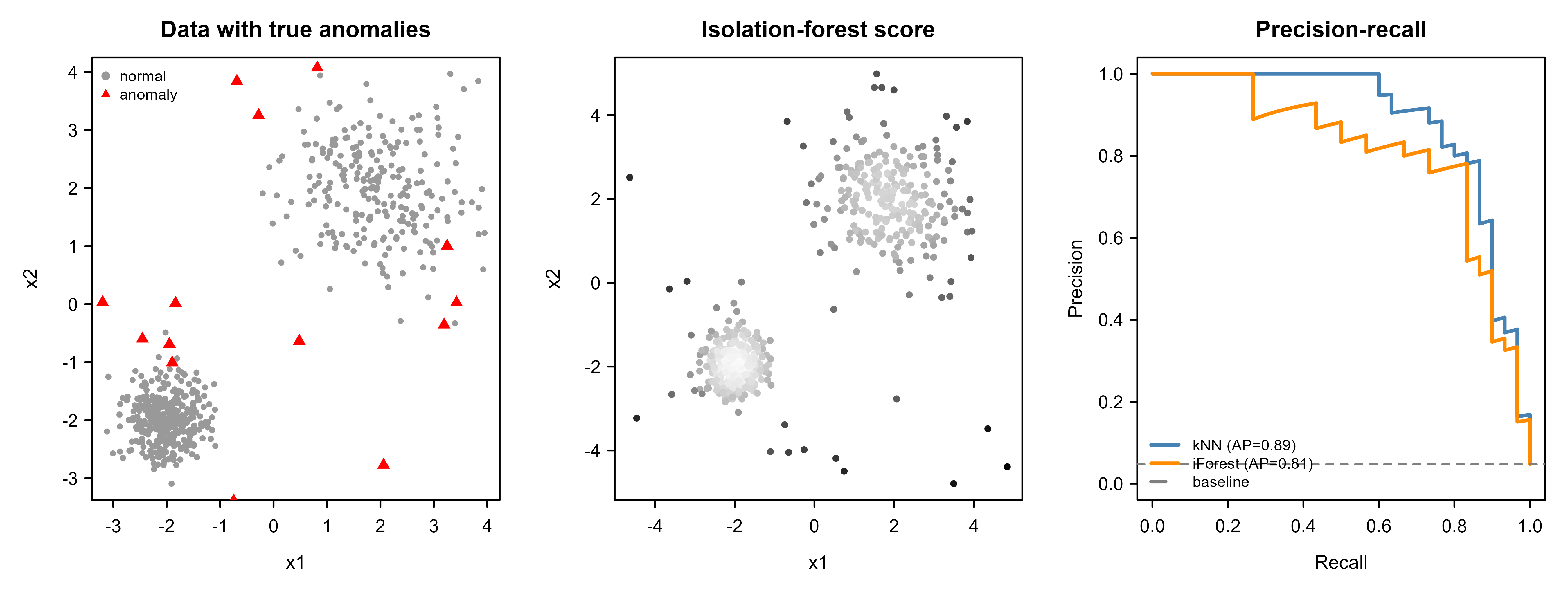
Figure 87.1 tells the whole story at a glance: the red triangles in the left panel sit exactly where the middle panel is darkest, and the right panel confirms both detectors recover most anomalies before precision collapses. The kNN score does slightly better here because the data is low-dimensional and the anomalies are genuinely far in Euclidean space; in higher dimensions the isolation forest would typically pull ahead.
Tip
For real use, prefer a maintained implementation: isotree or solitude for isolation forests, dbscan::lof for the Local Outlier Factor, and e1071::svm(type = "one-classification") for the one-class SVM. The from-scratch forest above is for understanding, not production; it is correct but slow.
The package version of the same isolation forest, shown for reference, would be a two-line call (left unevaluated since isotree is not assumed installed):
Show code
library(isotree)
model <- isolation.forest(as.data.frame(X), ntrees = 100, sample_size = 256)
if_score_pkg <- predict(model, as.data.frame(X))  # higher = more anomalous
87.10 Practical guidance and pitfalls
The methods above are easy to run and easy to misuse. A few principles separate a useful detector from a misleading one.
Scale your features. Distance and density methods (kNN, LOF, one-class SVM) compute distances, and a feature measured in dollars will dominate a feature measured in counts purely because of its numeric range. Standardize or robustly scale before scoring. Isolation forests are far less sensitive to scale, since they split per feature, which is one of their quiet advantages.
Mind the dimensionality. As \(p\) grows, all pairwise distances concentrate toward the same value and “nearest neighbor” becomes nearly meaningless, which guts LOF and kNN scores. In high dimensions, prefer isolation forests or autoencoders, or reduce dimension first (see Chapter 27). A related trap is irrelevant features: a handful of noise dimensions can drown the signal in any distance-based method.
Do not tune on the test set. It is tempting, with so few labeled anomalies, to peek at them when choosing \(k\), \(\nu\), or the threshold. This inflates every metric and the gain evaporates in production. Hold out a labeled validation set if you have any labels at all, and choose the operating threshold there.
Watch for contamination during training. One-class SVMs and autoencoders assume the training data is mostly normal. If anomalies are mixed in, the model learns to treat them as normal and stops flagging them. When you can, train on data verified to be clean, or use a method like the isolation forest that tolerates contamination by design.
Calibrate the threshold to a budget, not to 0.5. The default cutoff of a classifier is irrelevant here. Decide how many alerts a human can review per day, or what recall the application demands, and set \(\tau\) to meet that, exactly the cutoff reasoning from the class imbalance chapter (Chapter 80).
Warning
A detector with high average precision can still be operationally useless if its alerts arrive faster than anyone can triage them. The “alert fatigue” failure mode, where investigators stop trusting a noisy detector, is a product problem that good scores alone do not solve. Always pair a score with a realistic alert budget.
Choose the method to match the anomaly type. Everything in the demo finds point anomalies. Contextual anomalies need the context split (model the behavioral variable given the context, then score residuals). Collective anomalies need methods that respect sequence or graph structure, such as sliding-window reconstruction error or change-point detection. Using a point-anomaly detector on a collective-anomaly problem will quietly miss the very thing you care about.
Table 87.3 compares the main methods to guide the first choice.
| Method | Assumes | Scales to high dim | Catches | Compute cost |
|---|---|---|---|---|
| Statistical (z, Grubbs, Mahalanobis) | Parametric (often Gaussian) | Low dim only | Global point | Trivial |
| kNN distance | Meaningful distances | Poor in high dim | Global point | Low |
| Local Outlier Factor | Meaningful distances | Poor in high dim | Local point | Moderate |
| Isolation forest | None (axis-aligned splits) | Good | Point | Low |
| One-class SVM | Mostly-clean normal data | Moderate | Point | Moderate |
| Autoencoder | Enough normal data to train | Good | Point / structured | High |
Table 87.3 is a starting map, not a verdict: for a few thousand low-dimensional points, LOF or a kNN score is the fast first move; for large or high-dimensional data, reach for an isolation forest; for rich nonlinear data with abundant normal examples, an autoencoder; and when the normal data is genuinely Gaussian and low-dimensional, the classical tests are hard to beat for simplicity.
87.11 Further reading
For a comprehensive survey of the field and its taxonomy of anomaly types, see Chandola, Banerjee, and Kumar (2009), “Anomaly Detection: A Survey”. The Local Outlier Factor was introduced by Breunig, Kriegel, Ng, and Sander (2000). The isolation forest is due to Liu, Ting, and Zhou (2008), with an extended treatment in their later journal version. The one-class SVM originates with Schölkopf, Platt, Shawe-Taylor, Smola, and Williamson (2001), “Estimating the Support of a High-Dimensional Distribution”. For deep-learning approaches including autoencoder and reconstruction-based detection, see the survey by Chalapathy and Chawla (2019). The trade-off between ROC and precision-recall evaluation under class imbalance is argued clearly by Davis and Goadrich (2006), “The Relationship Between Precision-Recall and ROC Curves”. Aggarwal’s textbook “Outlier Analysis” (2017) is the standard book-length reference and ties these methods together with statistical estimation.